Here at Mux we've been quietly (or not so quietly) working on an open source project called Media Chrome. We're biased, of course, but as folks who have built a lot of players, we think we've really got something special here. If you’re building a video player on the web, we’d love your help testing it out, providing feedback, and helping us build a comprehensive set of UI components that can be used with any video playback engine.
Key insight: separate the UI from the playback engine
The one key insight that Media Chrome makes is that the UI components are separated from the playback engine. This is a significant separation of concerns and it allows us to unlock a massive amount of potential when it comes to building out video player UIs without having to worry about the underlying playback technology.
Playback is a difficult beast on its own. Depending on what streaming format is used, you might be constrained on the player that you pick. Is your video Dash? HLS? Live stream? Low-latency live? Is it Apple’s low-latency HLS or a proprietary low-latency HLS format?
The thing is your users and your designers and front-end devs don’t care about the streaming format of your video. Designers want to build out the best possible user experience regardless of Dash, HLS, or low latency. Your streaming format should not back you into a corner when it comes to building a player.
That’s why we’ve separated out these concerns for Media Chrome. Media Chrome focuses strictly on building UI elements that can be used with any playback technology.
Video streaming engineers should work on solving playback, while designers and frontend developers should work on player UX
The way most web applications that contain video are built these days is that a designer builds out all the usual web application functionality. All the UX can be specifically designed and customized with HTML and CSS, but the designer hits a brick wall when they want to design the playback experience. They’re either constrained by whichever player the engineers have picked off the shelf, or they’ll have to build something custom from the ground up.
Media Chrome strikes a balance right in the middle. You get individual controls that can be moved around and styled with CSS the same way you would style HTML form elements.
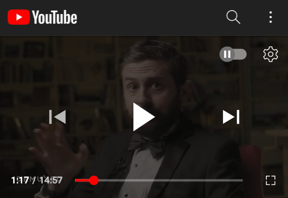
A common pain point also comes into play when you want different controls on mobile views vs. desktop. Most players implement a control bar like this:

This works great on desktop, when the user has a mouse, but what happens when you’re on a 375px wide mobile device? That UI is not going to work. You will want to overlay the controls on top of the player to accommodate for the lack of horizontal space.
Styling a video player should feel like styling HTML
What we’re going for here is pretty simple:
- HTML: good 'ol markup language native to the browser
- CSS: great for styling HTML
- Declarative: Want a play button? Use <media-play-button>, Want a fullscreen button? Use <media-fullscreen-button>.
The strength of this approach is that the flexibility is unbounded and a designer can drop in and actually build the experience with HTML and CSS and doesn’t have to be locked in to any kind of default layout.
The other strength of plain old HTML and CSS is that it works with native browser APIs, meaning it’s compatible with any Javascript framework.
Let’s look at an example:
<media-controller>
  <video slot="media" src="https://stream.mux.com/DS00Spx1CV902MCtPj5WknGlR102V5HFkDe/high.mp4"></video>
  <media-control-bar>
    <media-play-button></media-play-button>
    <media-mute-button></media-mute-button>
    <media-volume-range></media-volume-range>
    <media-time-range></media-time-range>
    <media-pip-button></media-pip-button>
    <media-fullscreen-button></media-fullscreen-button>
  </media-control-bar>
</media-controller>
This is a very simplistic example, and just by reading the markup you can tell exactly what this looks like:
- There’s a video mp4 being loaded as the media source
- There’s a control bar
- The control bar has the following controls: play button, mute button, volume range, time range, picture-in-picture button, full screen button
That’s it! You can rearrange the order of the buttons, style them with CSS, and interact with the individual HTML elements the same way you would if you were designing a form element.
Now let’s look at a more complex example where we want a set of mobile controls and a set of desktop controls. Again, we can do this with HTML and CSS the same way we would if we were styling anything.
Steps:
- Add a desktop class and a media query so that class will only show on desktop
- Add a mobile class and make sure that class only shows on mobile
<style>
  .desktop {
    display: none;
  }
  @media(min-width: 768px) {
    .desktop {
      display: inline-flex;
    }
    .mobile {
      display: none;
    }
  }
</style>

<media-controller>
  <video slot="media" src="https://stream.mux.com/DS00Spx1CV902MCtPj5WknGlR102V5HFkDe/high.mp4"></video>
  <!-- Desktop control bar with a 6 control elements in a row -->
  <media-control-bar class="desktop">
    <media-play-button></media-play-button>
    <media-mute-button></media-mute-button>
    <media-volume-range></media-volume-range>
    <media-time-range></media-time-range>
    <media-pip-button></media-pip-button>
    <media-fullscreen-button></media-fullscreen-button>
  </media-control-bar>
  <!-- Mobile control bar with a play button and a time range -->
  <media-control-bar class="mobile">
    <media-play-button></media-play-button>
    <media-time-range></media-time-range>
  </media-control-bar>
</media-controller>The media "slot" allows the controls to hook into the playback engine
Notice the “slot” attribute on the video element in the example above: <video slot=”media">. Slots are native to the browser and are a feature of custom elements. Media Chrome uses a slot to say which media element should be connected to the controls (think of a VCR tape slot, if you remember those). In this simple example, the playback engine is an HTML5 video element with an MP4 file. But the superpower here is that the element in the media slot can be any element that conforms to the HTML video element specification.In other words, the media slot can be:
- A <video> element with a src natively supported by the browser
- A <video> element powered by HLS.js or Dash.js
- A <mux-video> element (see: muxinc/elements and the blog post)
- Any custom element that you create. If you’re a player developer and you build some proprietary streaming tech, you can create a media element that works with Media Chrome.
Using "slots" to customize layout
The control bar is the most basic UI component of a video player. Most players default to shoving all the controls into a control bar pinned to the bottom of the player. That works just fine, but when you start designing players for mobile it’s common to overlay elements on top of the player.
See YouTube, for example:
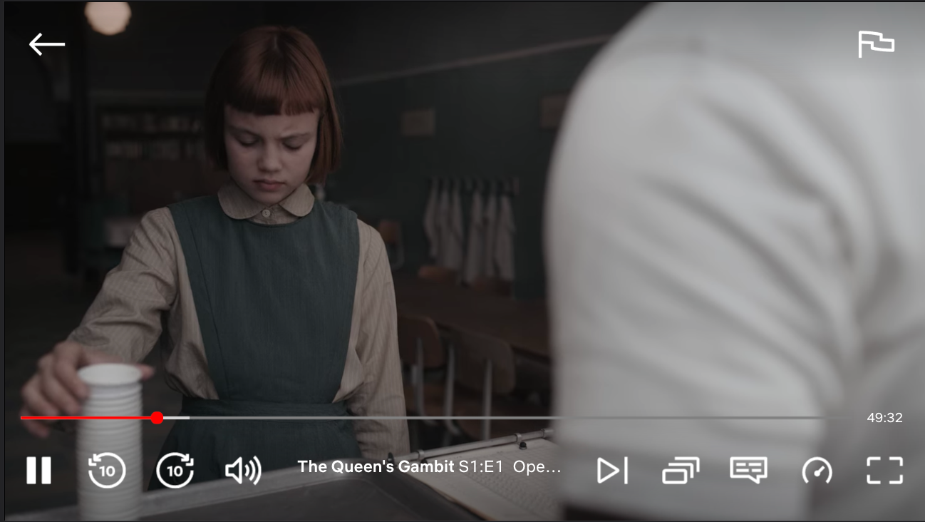
The Netflix player on mobile has 2 control bars vertically stacked and then in the top corners, it features a back button and a "flag" icon in the top right.
Media Chrome makes this possible with a few other slots. You can control where any arbitrary markup renders by specifying a “slot” attribute on an HTML element. The built-in most common slots are:
- slot="top-chrome": renders at the top of the media element. Useful for things like a logo, a video title or a <media-fullscreen-button>
- slot="centered-chrome": centered horizontally and vertically over the entire media element. Useful for things like a big play button or things like <media-seek-backward-button> and <media-seek-forward-button> (skip forward/back 30 seconds)
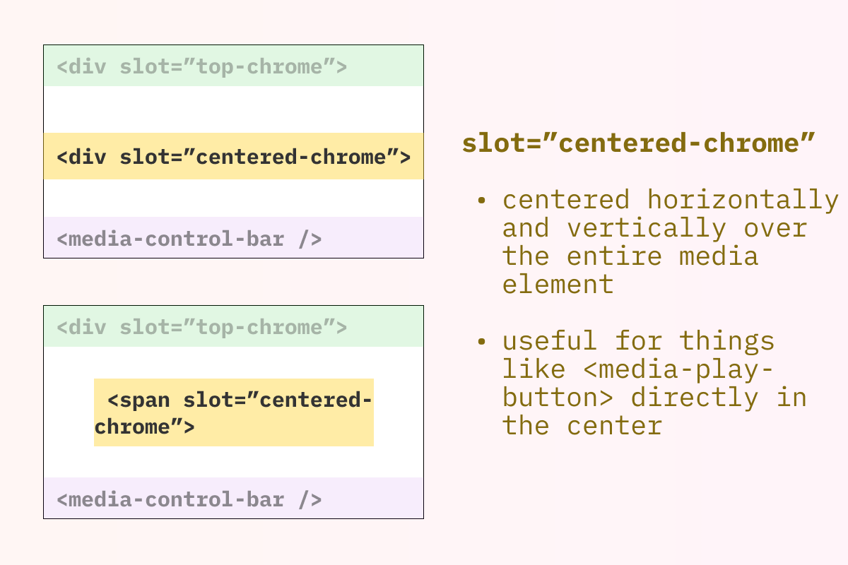
The combination of slots and custom CSS gives you superpowers to create custom layouts for mobile and desktop experiences.
<style>
  .desktop {
    display: none;
  }
  @media(min-width: 768px) {
    .desktop {
      display: inline-flex;
    }
    .mobile {
      display: none;
    }
  }
</style>

<media-controller>
  <video slot="media" src="https://stream.mux.com/DS00Spx1CV902MCtPj5WknGlR102V5HFkDe/high.mp4"></video>
  <div slot="top-chrome">
    <h1>Video Title</h1>
    <media-pip-button></media-pip-button>
    <media-fullscreen-button></media-fullscreen-button>
  </div>
  <div slot="centered-chrome">
    <media-seek-backward-button></media-seek-backward-button>
    <media-play-button></media-play-button>
    <media-seek-forward-button></media-seek-forward-button>
  </div>
  <!-- Desktop control bar with a bunch of controls -->
  <media-control-bar class="desktop">
    <media-play-button></media-play-button>
    <media-mute-button></media-mute-button>
    <media-volume-range></media-volume-range>
    <media-time-range></media-time-range>
  </media-control-bar>
  <!-- Mobile control bar with a play button and a time range -->
  <media-control-bar class="mobile">
    <media-play-button></media-play-button>
    <media-time-range></media-time-range>
  </media-control-bar>
</media-controller>Customizing icons with more slots
Media Chrome has a straightforward API for overriding the default icons using slots.
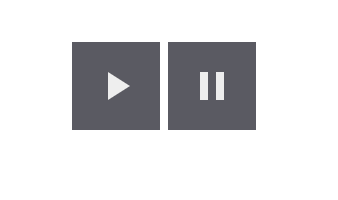
Let’s take a look at <media-play-button>:
<media-play-button></media-play-button>That will give you the default "play" icon when the video is paused and the default "pause" icon when the video is playing:
If you have your own icons you want to use instead, specify them with slot="play" and slot=”pause”
<media-play-button>
  <svg slot="play" viewBox="0 0 161 160"><!-- Your SVG--></svg>
  <svg slot="pause" viewBox="0 0 161 160"><!-- Your SVG--></svg>
</media-play-button>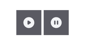
Slots don’t have to be svgs either; they can be any HTML tag:
<media-play-button>
  <span slot="play">play</span>
  <span slot="pause">pause</span>
</media-play-button>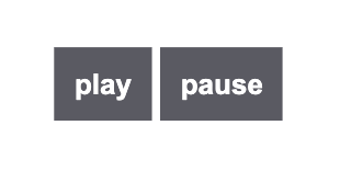
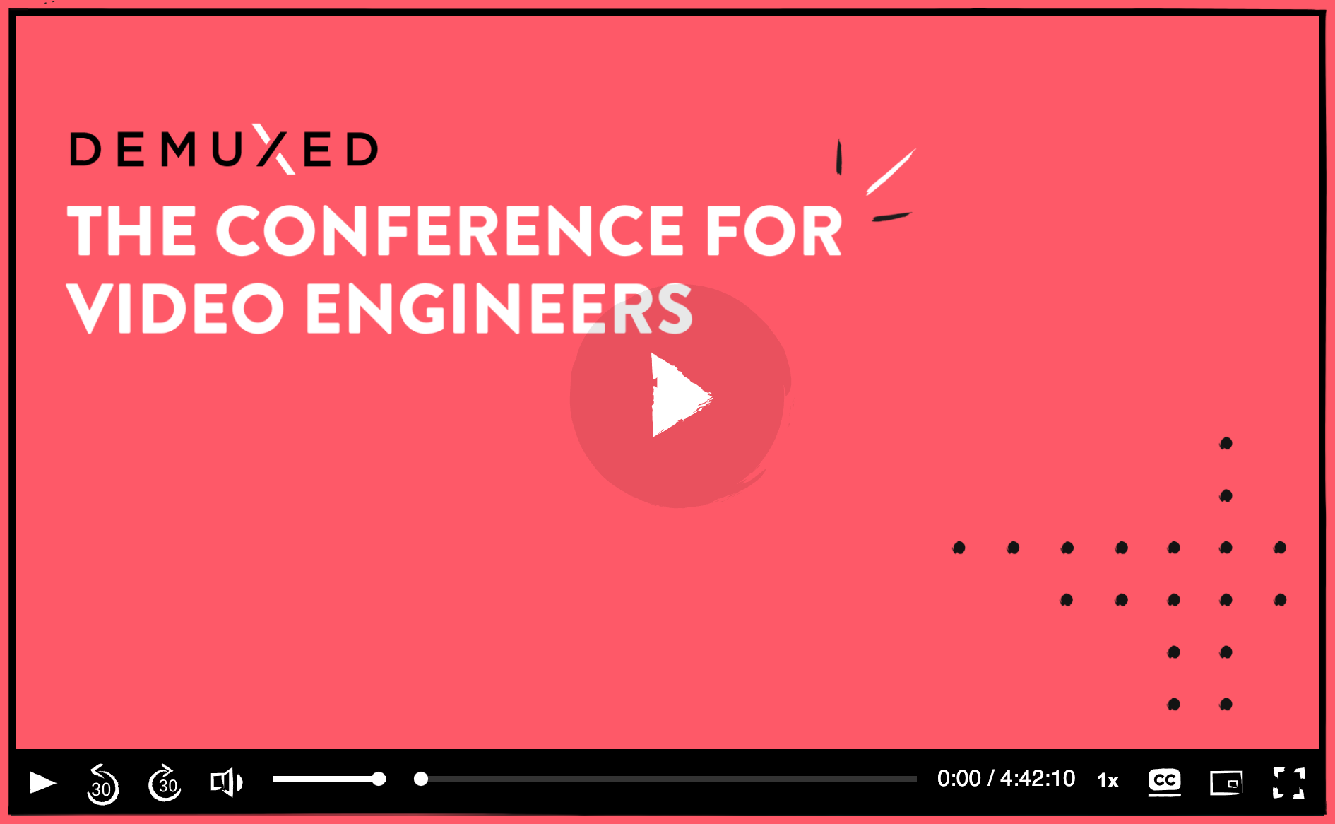
Dogfooding at Demuxed
This year in 2021 we used Media Chrome to build out the player experience for the Demuxed conference. This was the first "in production" use of the project. We learned a lot and have applied most of our learnings to the project.
Who is Media Chrome for today?
Today, Media Chrome is for developers and designers who are building playback experiences on the web. If you have ever used a video player and felt constrained by the design it gives you, Media Chrome provides the lower level individual building blocks for designing your own player.
If you’re a UX designer and you have ideas about how to build a great playback experience, but you haven’t been able to because none of the players out there are able to support your vision then Media Chrome is meant for you.
If you are a player developer who works on building players and client-side streaming tech, we’d love it if you tried out Media Chrome. See if it can be the UI layer for your player while you focus on maintaining the streaming tech. Or better yet, you could build a custom element that is compatible with the media slot for Media Chrome. That means that anyone using your streaming tech would be able to leverage Media Chrome to build a custom UI around it.
Today, Media Chrome offers the individual lego blocks for building a player. We’d love to expand on that and offer some more drop-in solutions. We’re working on a concept of themes so you can drop in a pre-built theme that comes with a layout, a set of colors, and icons to suit your style.
Reference links
- GitHub repo: muxinc/Media Chrome
- Heff talking about using web components to build video players at Demuxed in 2015 and again at Demuxed in 2020
- media-chrome.org
We’re building all of this out in the open so we’d love your feedback if you give it a try. It’s early days and if you have strong opinions about this, please book a time with me on Calendly so we can chat 1:1 about it.