
We were recently excited to announce our new scoring update for Mux Data. Here is an in-depth look into how and why we decided to change our Viewer Experience Score for the better.
Score... what is it good for?
A constant problem facing decision makers is how to deal with uncertainty. We are often faced with a broad challenge with multiple outcomes and competing goals, and we must determine the best outcome out of a large possible set.
This problem is rarely easy and, worst of all, humans are not very good at it—even with considerable practice. Having good interpretable data can be a huge boon to making smart decisions, but unclear and ambiguous data could instead making a tough situation even worse.

When it comes to analyzing viewer experience for online video, the challenge might seem straightforward at first. We want a great experience when watching video. But what does this mean? We can broadly breakdown our challenge into secondary goals such as:
- High Video Quality
- Smooth Video Playback
- Fast Startup Time
- No Playback Errors
If all these criteria are high, then we can be sure the video experience is great, and vice versa. Additionally, rather than tracking these criteria individually, we want to combine them into a single overall score, so that we can assess the current state of our video in a single glance. However, determining the right way the combine these criteria is not a simple task. To do so, we first have to ask several questions about how these metrics relate to one another.
Is having smooth playback the same as having high video quality? If not, what is the relationship between the two? Are they independent?
For example, if the video quality is high, maybe a few seconds of rebuffering becomes more tolerable than if the video quality is low.
Is having slow startup time and high video quality the same viewer experience as having fast startup time and low video quality? If not, how much of startup time can we trade for video quality before the two metrics become equal?

As you can see, the rabbit hole of questions and decisions is deep and convoluted. Unfortunately, ignoring them leads to suboptimal outcomes and bad experiences for users. So, in order to improve the scoring methodology for Mux Data, we decided to take a more analytical multi-step approach:
- First, we mapped out new utility curves for our underlying metrics.
- Next, we optimized the parameters of these utility curves so that they fit along a traditional A-F grade scale.
- Using these utility curves, we formulated a set of trade-off equations that helped us combine our secondary goals (high video quality, smooth playback, etc) into a single overall score.
- We evaluated the new overall score on key metrics and found it was a much better predictor of increased watch time, which validates our improved approach.
Utility Curves
Mapping utility curves for different attributes across different populations requires special consideration. For example, in order to combine the score for Startup Time and Video Quality, we want them to operate on the same scale. 100 is best and 0 is worst.
However, what I consider 100 might be different than someone else, and comparing a 50 for Startup with a 50 for Quality is difficult since they are also measured differently.
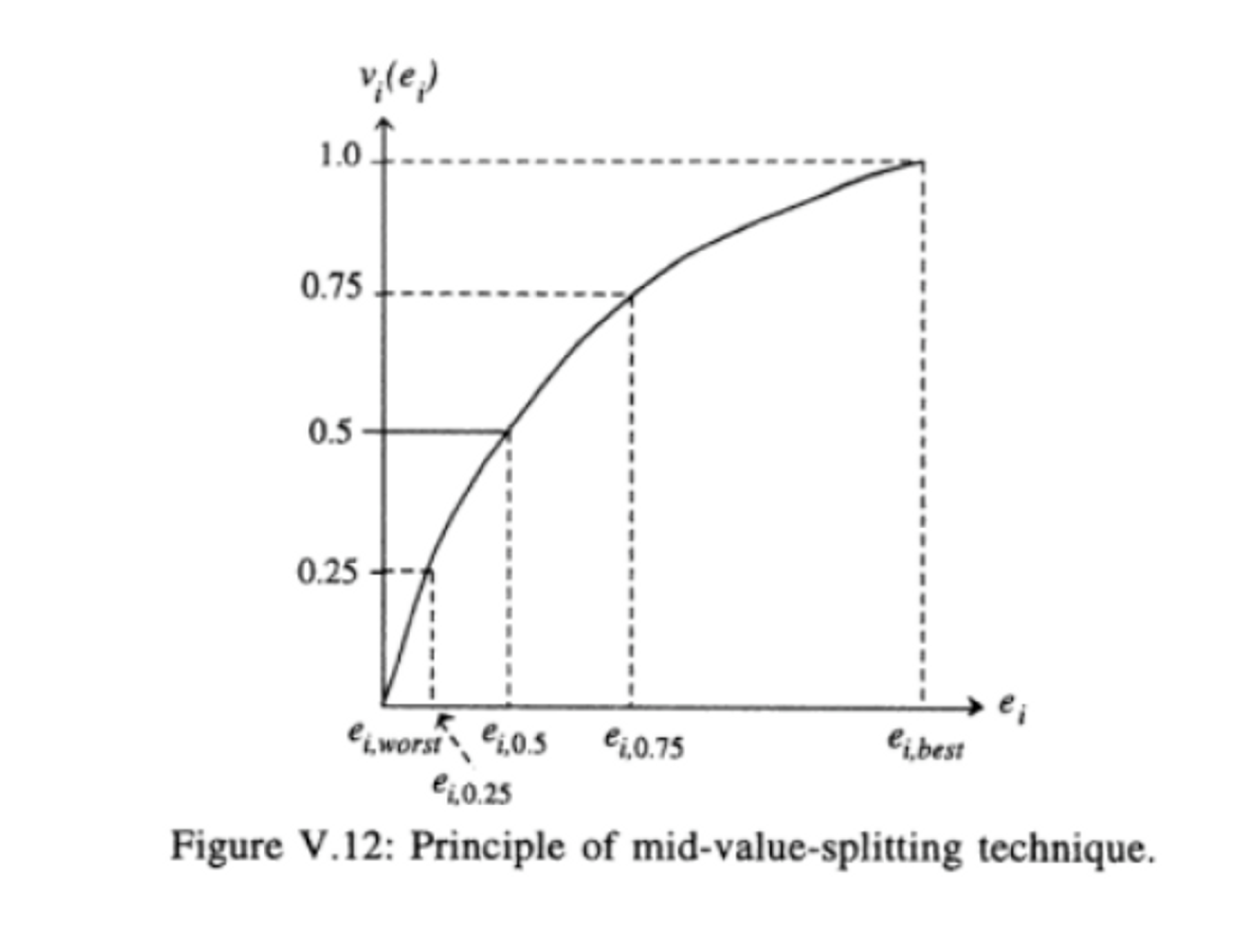
In order to solve this problem, we utilized a technique called mid-value splitting. The specifics of this technique is beyond the scope of this blogpost, but essentially, we estimate a utility curve by identifying the best and worst case scenarios for each metric.
Then, we find the midpoint by determining a point of indifference between the best and worst case. We continue this methodology using the midpoint as a substitute for the worst and best cases until multiple points have been mapped along the curve.
Once the utility curves have been mapped, we can then move on to determine trade-offs between pairs of attributes.
Determining trade-offs
The old score methodology combined attributes by applying the minimum score in the set.

This makes a poor score in one attribute to be equivalent to a poor score in every attribute. This also doesn’t take into account the relative importance of each attribute. Instead of viewing the attributes individually, we should be viewing them as interconnected. This means creating new value functions that measures the cost of trading one metric for another.
For example, let’s say you want to increase your startup time score. You can do so by lowering your quality a little bit, but will the trade-off be worth it? That depends on the relationship between the two metrics and their underlying utility curves.
Our value functions are just pairwise models of those relationships. So in our example, we would model the startup and quality relationship as:

This function is the additive value of startup and quality, and λ1 and λ2 are the value tradeoffs between the two attributes. V(s) and V(q) are the utility curve functions that we previously defined.
We continue this method for each metric to get the new equation:

V(s, r) represents the tradeoff relationship between startup and rebuffering and V(r, q) is the relationship between rebuffering and quality. V(p) is the playback value function, which is a multiplicative value since none of the metrics are relevant if a playback error occurs.
Evaluation
So what are some of the benefits of this scoring system?
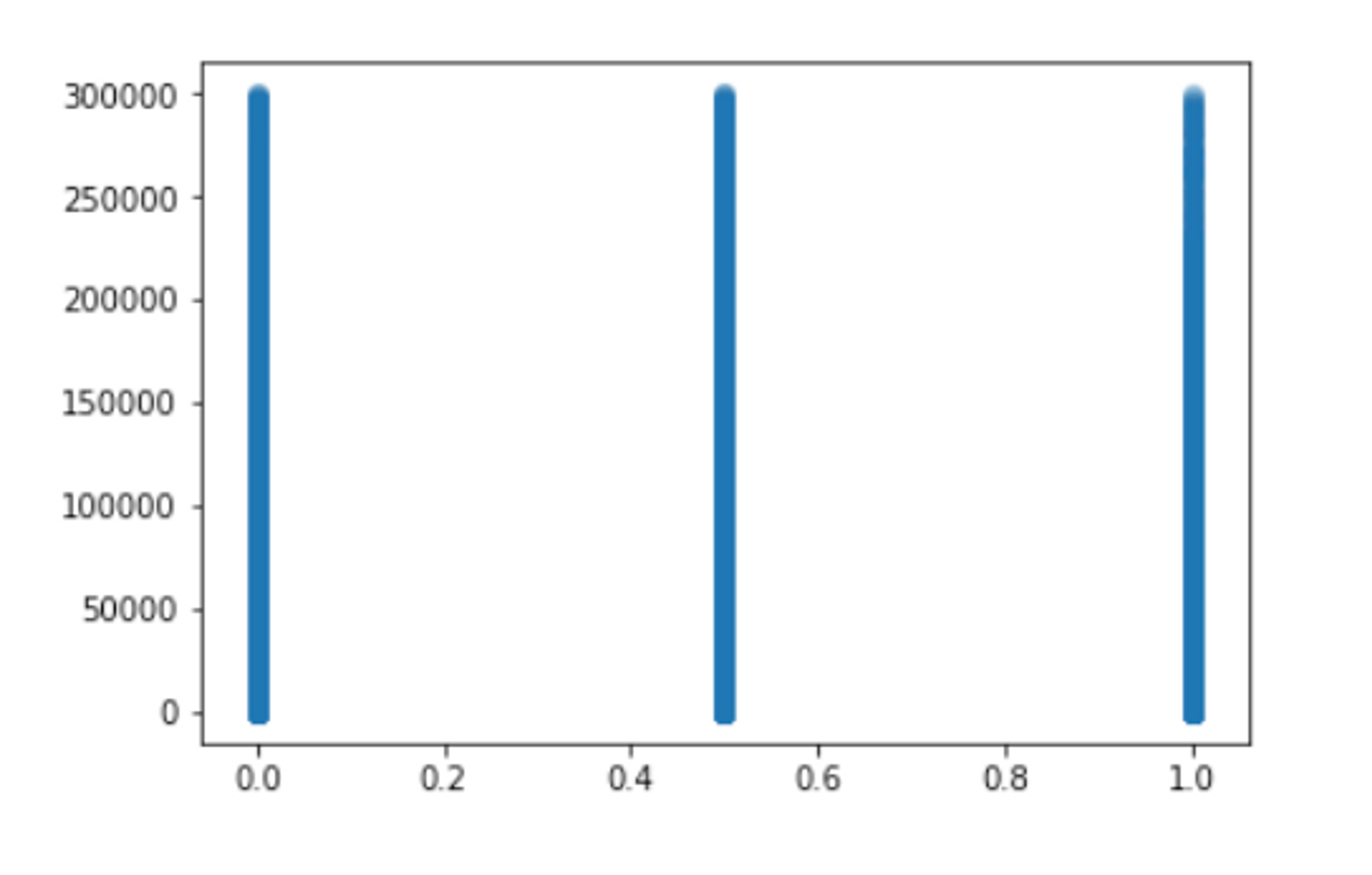
In our previous scoring methodology, a view could only receive a score of 0, 50, or 100. If we make a scatter plot of the scores against watch time on the y-axis, we see the information is not very useful. There doesn't appear to be a difference between high vs low scores.
With the new score methodology, we can quickly get a more detailed and insightful scatter plot of views.
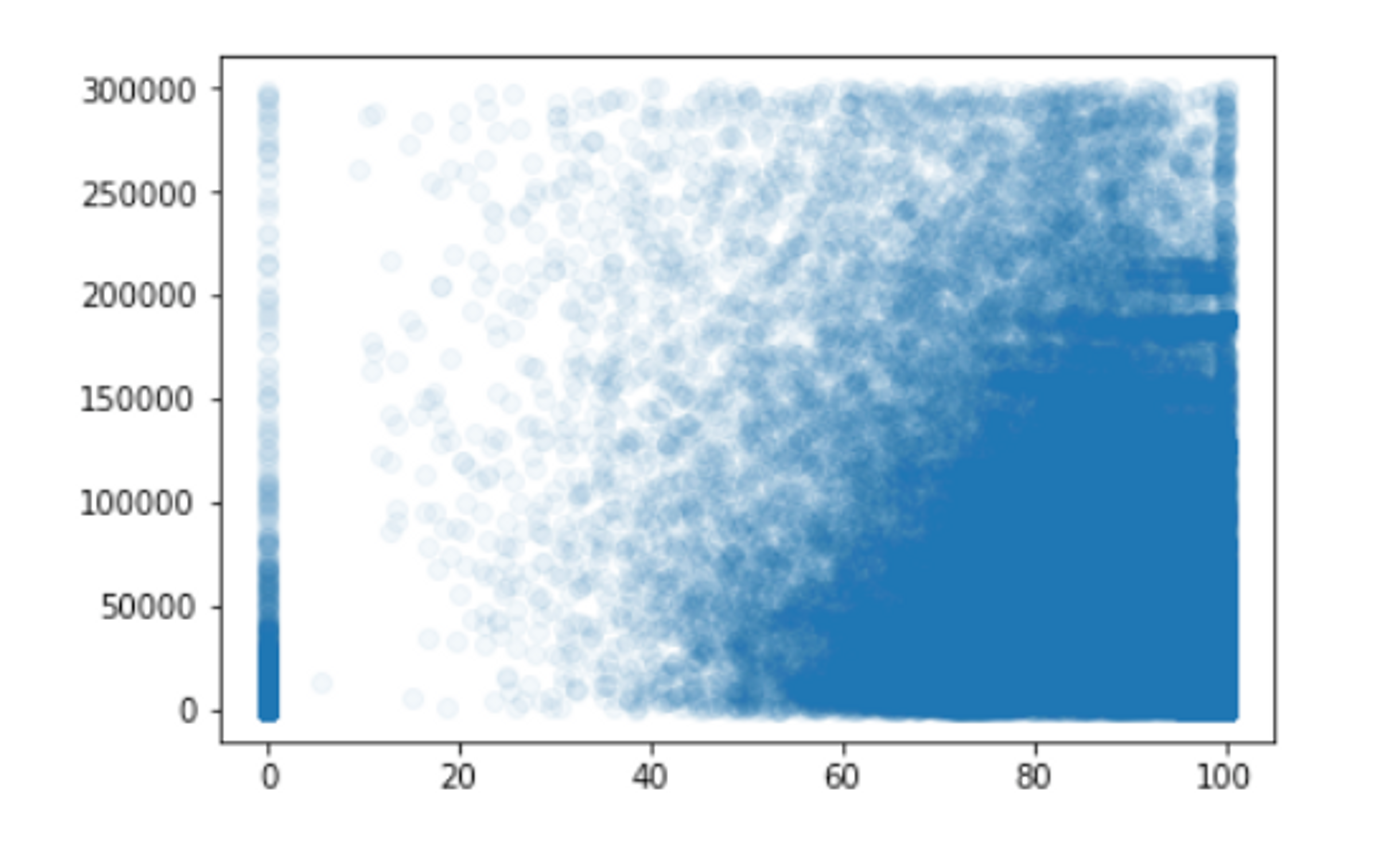
Here, we can clearly see the correlation between watch time (y-axis) and a view's overall score (x-axis). This chart shows that optimizing for higher experience scores could lead to longer watch times, which is often the true primary goal. More importantly, it helps estimate the kind of payoff you could receive from improving your scores to specific levels.
The new scoring methodology allows us to better understand the relationship between QoS metrics and the actual end-user experience. Using machine learning, we can even fine-tune the model to adapt to specific customers and their unique user behaviors. We plan on continually improving this model so that customers of Mux Data can easily evaluate and improve their video experiences.
If you have questions or feedback, please feel free to reach out to us at info@mux.com.