When an outage or customer-impacting incident occurs, there are a few steps that inevitably occur as part of resolving the incident. You want to resolve the problems as quickly and responsibly as possible, but you also need to communicate and follow-up with reliability improvements.
Since we released our Real-Time Dashboard early last year, we have talked with many development and operations teams about how they respond to incidents and how our Real-Time Dashboard is used in those situations. Based on that feedback, we worked on ways to make users more efficient when dealing with these situations. Today, we are announcing some important new features for the Mux Data Real-Time Dashboard.
To put some of these features in context, let’s review how video teams often deal with customer-facing incidents and how they manage them in order.
Incident response generally includes, but is not limited to, the following activities:
- Investigate the incident
- Communicate with stakeholders
- Resolve the issue
- Improve your resiliency
It’s never fun to find yourself in the middle of a customer impacting issue, but our new Real-Time Dashboard features can make it a little easier to manage.
Investigate the Incident
You probably know the feeling - everything’s going fine as you’re watching your service health metrics until something starts to spike. You get woken up by a call in the early morning hours. Or your Twitter mentions start to pile up with customers announcing your outage to the world.
When you find yourself in this situation, the most important thing to do is to breathe. Your life is about to get stressful and filled with urgency, but the most important thing to remember is to stay calm. We’ve all been there and we feel for you. #hugops
The very next thing you need to do is to understand the scope of the problem that is being reported: when did it start, how many viewers did it impact, is it still on-going or when did it stop?
Understand the Scope
As you investigate, the first thing to do is understand the scope of the problem. Normally, the Real-Time Dashboard is updating every few seconds as events are fired from client players. As you see an issue, you can pause the display in order to focus on the specific time when the problem occurs and so that your incident isn’t aged off the chart. The Real-Time Dashboard will continue to update in the background; you can easily return to live updating once you get more information about when the incident started and the impact it is having on users.
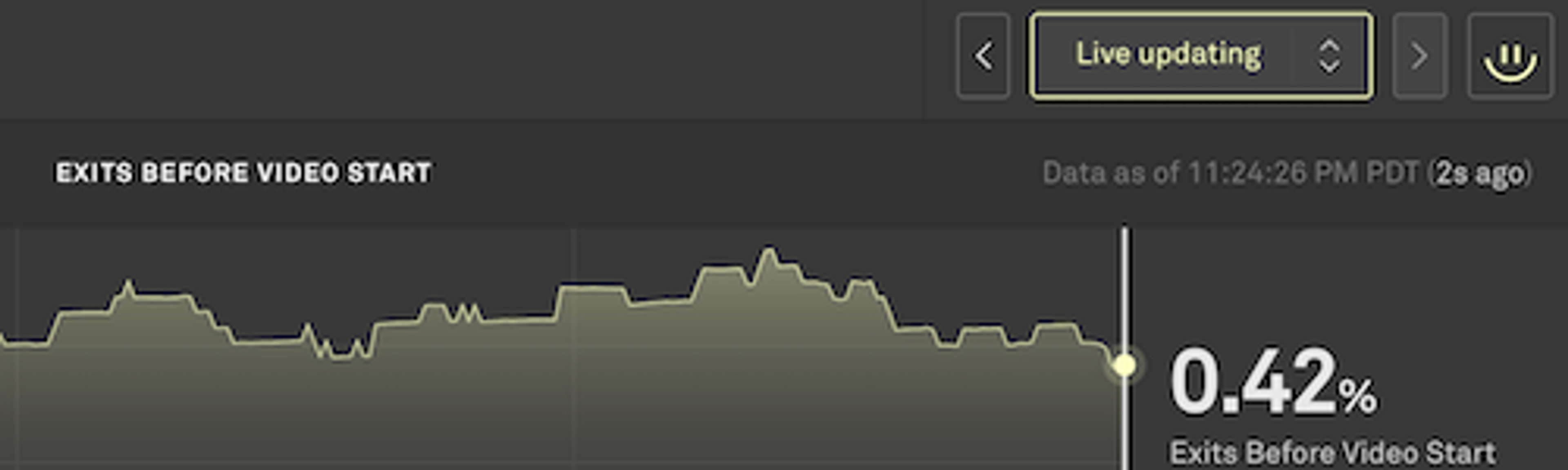
You can pause the display by clicking on a specific interval in the chart, clicking on the pause icon in the top right corner of the display, or by using the time selector in the dropdown to the left of the pause button.
Focus on the Impact
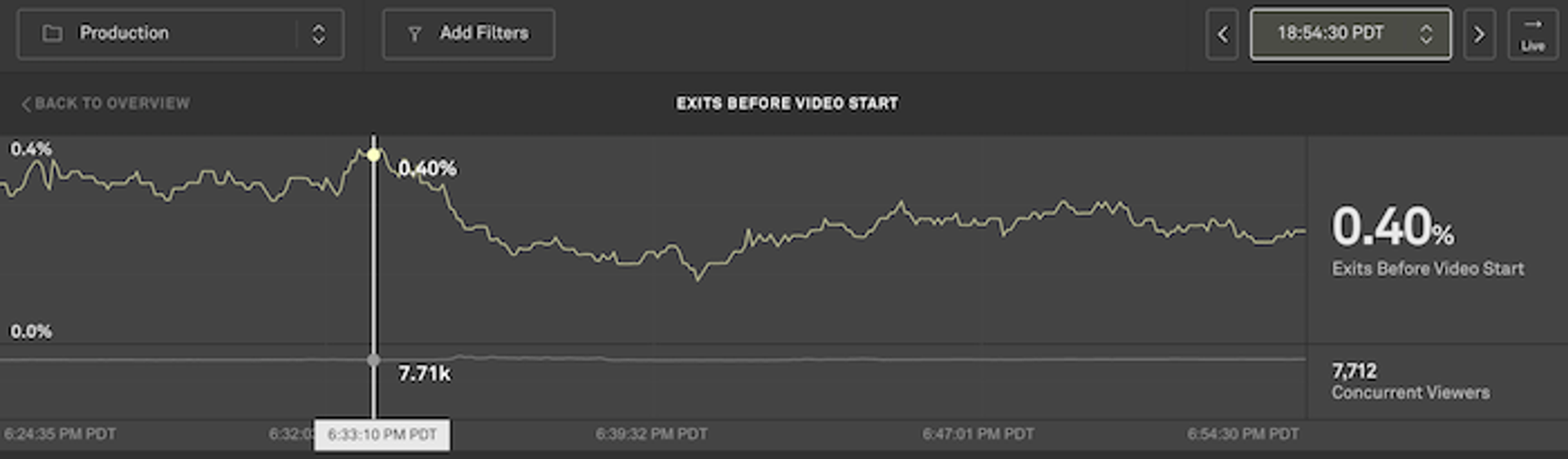
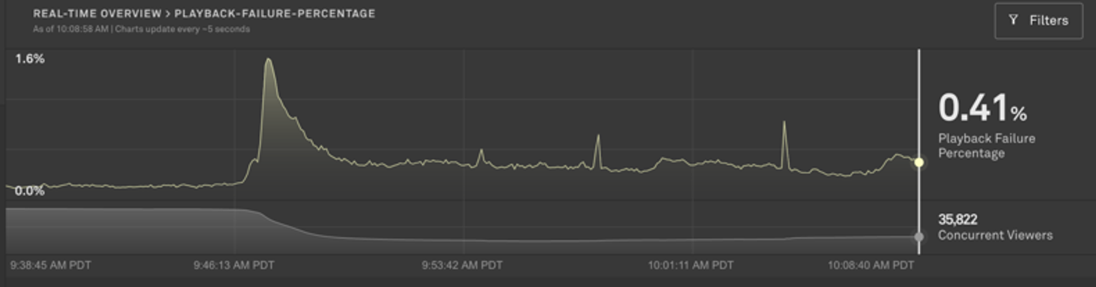
When performance drops unexpectedly, you need to be able to dig into the viewer data and find out what’s causing the problem. It’s often helpful to look at data directly before and after the performance change to compare normal vs current metrics. You can select an instance of time and the chart will pause on that time. From there, you can drill down on any of the dimensions and filter to specific geographies, players, CDNs, or ASNs.
Sometimes the cause of the performance regression is not obvious and requires some digging into the data. In the Breakdown section of the detail page under the charts, we generate and display a Negative Impact score that will help find the underlying cause of the issues. For each dimension you can see what values (such as the specific CDN, player, or network) are driving the metrics. You can filter to the values generating the largest Negative Impact in order to understand the scope of the specific problem.
History
Not every team can constantly monitor performance looking for performance changes. Oftentimes an event will occur and the team isn’t able to deal with it in the moment. A team member may only check-in on the performance every few hours or only when notified something is happening.
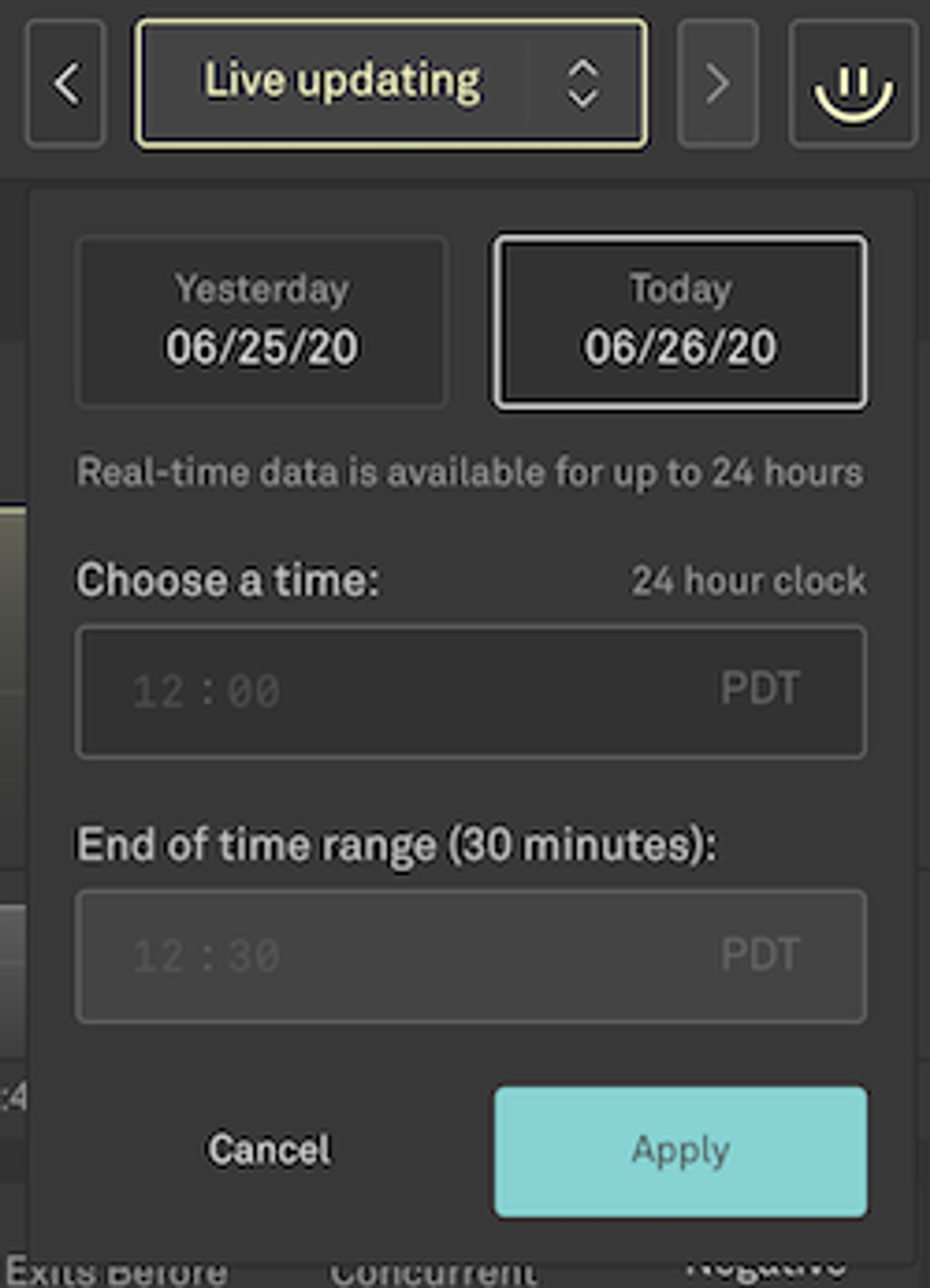
Real-Time Dashboard users can now access 24-hours of data rather than just 30 mins. You can move the chart backwards and forwards in 10 minute increments using the arrow buttons or choose a specific time that you’d like to look at.
If you get customer complaints about an issue after the fact, you can easily jump back a few hours and look into the real-time metrics to understand how widely the problem may have been, even if it is no longer occurring.
Current Concurrent Viewers (CCV) Secondary Chart
Whenever you’re investigating an incident, it is always important to understand how it’s impacting your viewers. Are users getting a bad experience but sticking around or are you quickly losing viewers? You can easily answer those questions on the metric detail page. Click on the metric in the Real-Time Dashboard to view the detail page. On that page, the CCV secondary chart is always displayed beneath the primary metric chart. You’re able to easily correlate how view levels are changing based on your specific filter and prioritise appropriately.
Communicate with Stakeholders
Although you may be heads-down trying to resolve the incident, it’s important that you take the time to share what you find with other stakeholders. Whether it is other engineers, management, or customers, you need to make sure that all stakeholders know something has gone wrong, that the issue is being addressed, and, if possible, what impacts the issue is having on the viewer experience.
Mux Data makes that easy to do with the other users in your Mux organization by giving you the ability to share the exact view you create of the dashboard. First, pause the metric display so that it contains the issue in the 30-minute bounds of the real-time chart. Then, filter the chart to the specific dimensions that exhibit the problem. The Negative Impact scores are helpful in finding the root cause of a problem if you don’t already know the scope.
Once you have a useful view of the data, simply copy the url and send it to any user that has access to your Mux data. The user is able to click on the url to load the Real-Time Dashboard with the metric displayed on the expected timeframe, along with any filters that have been set. From there your teammate can view the chart or continue to dig into the data by adding or modifying filters to pinpoint the source of the problem.
It’s worth noting that real-time data can be shared for up to 24 hours. If you need data beyond that, the Metrics reports are useful for longer-term reporting and experience optimization.
Resolve the Issue
Although Mux Data can give you a good idea of where to look to resolve the problem and the viewers impacted, it can’t actually fix the problem for you. You’ll need to rollback the release, fix the server, or switch away from the CDN that is causing errors.
Once you do make the change(s), the Real-Time Dashboard will tell you immediately if the issue has been resolved. If you’re successful, you’ll start to see an improvement in the metrics within just a few seconds. The low-latency reporting allows you to rapidly verify fixes or, if the changes didn’t work as expected, move on to another solution.
Similar to how having faster source code builds reduces the cost of compilation and allows developers to more easily iterate and code features, faster metrics allow teams to reduce the turnaround time for responding to fixes.
Improve your resiliency
This last step is the most commonly skipped: the retrospective and platform improvements. Please don’t disregard this step. It’s usually less of a priority because the immediate issue has been resolved and the dust has settled. But if you don’t solve the root cause or build in additional redundancy, you will inevitably hit the same problem again in the future. The fixes can take away time from short-term feature work and impact delivery dates but, in the long run, you are much better off paying the cost to fix the root cause rather than losing time and customer credibility in the future because of similar outages occurring repeatedly.
For the long-term analysis and retrospectives, Mux Data has historical metrics that cover most aspects of the viewer experience. The metrics data is updated after each video ends rather than in real-time but the data is stored for much longer (months vs. 24 hours) and has many more dimensions and filters available to use for analysis.
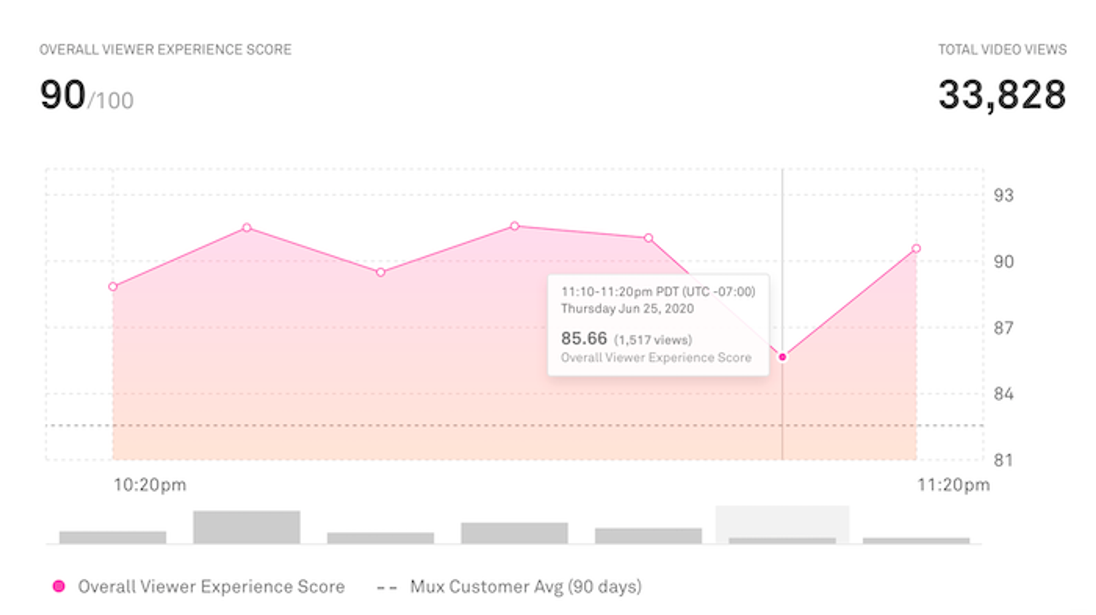
To make analysis even easier, you now are able to view the long-term metrics in 10-minute increments rather than by hour. This allows you to get more granular detail about the customer experience and focus on events that are shorter in duration.
As post-mortem changes are made, metrics allow you to measure performance changes over time. Such as: Did the changes negatively impact the start-up time? Has the rebuffering percentage improved as expected? Was the viewers' experience in Asia improved since adding a new, local CDN? All of these are easy to answer with the long-term metrics.
With these new features for the Real-Time Dashboard and metrics, Mux Data users will be able to respond to issues faster and more efficiently. As always, we love to hear your feedback about our new features and how we can help you operate your video platform as efficiently as possible. Let us know what you think!