This is part two in a two part series about how we revamped the charts in our video analytics product. If cool looking pictures, deuteranopia, and other design details are more your speed, check out part one. Otherwise, we're about to go on a journey into what charting library we chose and why.
When we first started displaying data at Mux, I did what every good JS engineer does: I blindly reached into the npm bag, pulled out a package, and used it to varying degrees of success.
Ok not quite, but at the time our needs felt a lot simpler. We had some data, and we wanted to chart it. The options explicitly in the React ecosystem were reasonably limited, so I ultimately made the call to go with Chart.js. It's served us well for over a year now, so if you're ever in need of some charts, I'd still suggest giving it a test drive.
Wait...you like Chart.js? Why switch?
Good question, observant reader. The more we've worked with React, the more valuable it's felt to be able to build components and pass them around. Chart.js is a great library, but even the most basic integration with a React project is going to involve wrapping the library in a component that ends up handing off to some lifecycle entirely outside of React. While that's not a problem in and of itself, that's indicative of the rest of the experience; you're not passing around components to handle rendering things like tooltips, you're building up a giant configuration object that you pass in as a prop (or props) to a silly wrapper component.
When our designer (that wears heelies sometimes) redesigned our entire charting world, it felt like the perfect time to revisit the React-specific charting options. Back to the npm bag we went, but this time we decided to take a few of the available options for a test drive.
What we wanted in a charting library
Requirements
- Easily composable charting components
- Standard chart types (line, area, stacked bar)
- The ability to use our own presentational React components
- Flexible enough to feel like we're not digging ourselves a hole
- Not awful to use (high bar, I know)
Nice to haves
- Data just works out of the box
- Multiple charts synchronized
- Zoomable areas
- Looks perfectly like the new designs without additional work on my part (weird, but none of the options fit this criterion)
Victory
Victory, by Formidable Labs, was the first library I tested out and, to be terribly honest, the one I would suggest others try out first. On the more superficial side of things, it's got a crazy impressive "used by" list full of groups that are known for their impressive, interactive graphs. There's a big, bold "alpha warning" in the README and I ran into a relatively small bug around data duplication in tooltips that. Neither of these were blockers, but they were at least enough for me to move onto kicking the tires with the other charting tools we were vetting.
Had Victory been the last library we'd tried out, I think we would have gone with it. The source is easy to follow, there's thorough documentation, and it has an active maintainer with a growing community. It checked all of our requirement boxes and most of the nice to haves, so we'll just talk about the features that I thought were really nice.
Pros
You can pass a different dataset to each chart component in a group.
This one might sound strange, but it's incredibly powerful. We end up making a request for each dataset in a graph, so for us, this was amazing. We were able to simply pass an array of the datasets to a higher level chart component, which under the hood iterated over the array and created a VictoryLine for each. 👌
The axes are smart enough to handle multiple datasets from above
I was worried that the above scenario was going to make the axes a nightmare, but nay. The VictoryAxis components do their best to handle the various datasets passed in and display coherent axes that work for all the charts plotted.
SVG is the omnipresent escape hatch
You can pretty much always nope out of the library directly to SVGs. It's hard to overstate how helpful this can be when you need it.
Very helpful and responsive maintainers
I ran into the issue around tooltip data duplication and almost immediately got help from one of the maintainers in their community chat room. I referenced an open issue that seemed similar, and the maintainer confirmed it was still a problem and provided a workaround we could use. The project feels well maintained with a clear roadmap as well as kind and responsive contributors. ️ ️❤️️
Cons
A little ugly out of the box
This could honestly go under the pros or the cons, but I'm grasping for cons so here you go: if you're looking for the library that's going to turn heads with defaults, this ain't it. It's easy to make just about anything you want, and the library stays out of your way the whole time, but you're going to need to put in some TLC.
Example
const labelSelector = p => parseFloat(p[1]) * 100;
const xSelector = p => new Date(p[0]);
const ySelector = p => parseFloat(p[1]) * 100;

const PrimaryTimelineChart: React.StatelessComponent<{ data: any[] }> = ({ data }) => (
  <VictoryChart>
    {data.map(chart => (
      <VictoryGroup
        key={chart.graph.id}
        data={chart.dataPoints}
        x={xSelector}
        y={ySelector}
        labels={labelSelector}
        labelComponent={<VictoryTooltip />}
        scale={{x: 'time', y: 'linear'}}>
        <VictoryLine style={{data: { stroke: chart.graph.color }}} />
        <VictoryScatter style={{data: { fill: chart.graph.color }}} />
      </VictoryGroup>
    ))}

    {/* Shared axis (time) */}
    <VictoryAxis
      fixLabelOverlap
      scale="time" />

    <VictoryAxis dependentAxis />
  </VictoryChart>
);react-vis
Next up on our trial train was Uber's react-vis. It's not entirely clear where they use these tools, but it's easy to imagine they have a lot of data to display in their driver and internal dashboards.
Pros
Looks great out of the box.
If you've got a chart working and the quality of your data doesn't suck, it probably looks great with no additional work.
Readable source code
This was particularly important because of the poor documentation at the time, but I found myself digging through source code more than anything else when trying to use the project. This seems to be encouraged considering all of the code samples are only available in the repository, which also naturally leads you to start digging into the source directly from a usage example.
Also allows for a dataset-per-chart-component
Like Victory, react-vis also lets you pass in a dataset to each XY Plot Series component.
Cons
Poor documentation
As I said in the pros, this seems to have improved in recent months, but even still, for such a powerful tool the documentation feels pretty scant and largely unhelpful. Particularly once we got past the most basic "get it working" usage it felt like we were almost entirely on our own.
Smaller community
One should always take "community" metrics with a mountain of salt, but for what it's worth, react-vis seems to be considerably smaller than the two other primary contenders, Recharts and Victory, in terms of both downloads per month on npm and stars on Github.
Requirements around data structure
To be fair, this is the norm for most charting libraries, so I think this is more a case of not having a nice feature that other libraries have. That said, react-vis expects a very specific data structure for each series component ({x: 123, y: 456}). Other libraries allow you to specify x and y selectors, which ended up being a nice touch. Handling it in a simple translator that returns the correct data is straight forward, though.
Example
Our initial testing ended up looking something like this. Not included is the additional work required to make the chart responsive.
// Translates data points to an object with (properly formatted) x and y coordinates
const translateDataPoints = (dataPoints: [string, string][]) =>
  dataPoints.map(([ x, y ]) => ({ x: new Date(x).getTime(), y: parseFloat(y) }));

const Plot = ({ width, data }) => (
  <XYPlot height={180} width={width}>
    <VerticalGridLines />
    <HorizontalGridLines />
    <XAxis />
    <YAxis />
    {data.map(chart => (
      <LineMarkSeries
        key={chart.graph.id}
        style={{ stroke: 'white' }}
        data={translateDataPoints(chart.dataPoints)} />
    ))}
  </XYPlot>
);Recharts
Recharts is the library we ended up going with and it's live on our dashboard right now. While initially evaluating, however, I was pretty skeptical for a couple of reasons:
- I was worried about how heavy it seemed. A lot of the basic examples were flashy with animations and gradients everywhere.
- Despite having a really well-done marketing site, the used by section only had two Chinese companies I'd never heard of. Turns out one of those "random Chinese companies" was a little startup called Alibaba, but I didn't know that because the logo was in, you guessed it, Chinese. There's this old saying about assumptions...
Implementing Recharts wasn't without its hiccups, but overall it checked just about all of our needs and wants boxes. The only real roadblock we ran into was at the very end of the implementation, but ultimately it was probably for the best and led us to revisit our design for other usability reasons.
Pros
Super hot out of the box
Almost too hot. This is going to be listed in the cons as well, but implementing a chart using nothing but defaults is going to yield a pretty sharp looking interface. It's almost hard to mess up on this front. Coincidentally, a chunk of the defaults did end up being pretty close to our designs, so for at least a few of our charting scenarios the defaults just needed a few tweaks. 🔥
Built on top of D3
One of Victory's superpowers was being able to nope out to using an SVG directly at any time, and Recharts super power is the D3 escape hatch. There were times where it made more sense to read the D3 documentation directly when setting options for components, which was oddly comforting.
Custom components are the hammer, and everything just became a nail
Most components within Recharts allow you to pass in a custom component for rendering. At first blush this seemed like it would primarily only come into play for custom components such as our tooltip display, but ultimately we ended up abusing them all over the place to bend Recharts to our will.
One example is our x-axis, which we wanted to change based on the selected timeframe. If someone is looking at a small timeframe, we wanted to show a few hourly ticks on the x-axis. If someone was looking at a larger timeframe, we wanted to switch this over to daily ticks. At first, this seemed like a simple use of the tickFormatter prop, but this ended up introducing an unfortunate bug where we were showing duplicate days if we let Recharts pick the default interval. We solved this by being smarter about choosing an interval based on context and using a custom component to fix the alignment issues that caused.
Cons
Lots of things to disable out of the box
If you add a chart with some tooltips, you're going to get pretty long animations on initialization with fancy easing functions around tooltip movement. This might be what you want, but it felt like there was a decent amount of time spent figuring out how to disable a lot of these bells and whistles.
Only one data prop
Unlike the two previous tools, Recharts doesn't allow you to provide a dataset to each chart component in a composed chart. What we ended up needing to do was combine all the individual charts returned from the API into one data structure. Not a big deal, or even unexpected, but a minor headache.
Community seems smaller than it appeared
It's weird, but it's almost like vanity metrics such as Github stars and npm downloads don't really mean that much... The project is definitely still active, and the maintainer does respond, but it appears there's largely one maintainer pushing things forward and that means things like new issues can wait a little while for responses. Sometimes there's a community chat room to fall back on when the issue tracker is lagging, but unfortunately, the Gitter history for Recharts is just months of people popping in and asking a question with no response from their peers. Just to note: I throw absolutely no shade at the maintainer on that front, FOSS is a thankless job, and it's (almost certainly) not their job to provide support beyond providing a wonderfully helpful library. ✌️
Example
This example unsurprisingly ended up the furthest along because it's the one that's live on our dashboard right now, but we've still stripped out quite a bit of code to at least make it vaguely comparable to the other examples.
const formatXAxis = timeframe => value => formatDate(timeframe, value);
const formatYAxis = type => value => formatValue(value, type);
const getPointValue = id => points => points[id].value;

const PrimaryTimelineChart: React.StatelessComponent<any> = (props) => {
  const { data, type } = this.props;
  const { points, graphs, globalScore } = dataTranslator(data, type);

  return (
    <ResponsiveContainer aspect={3}>
      <ComposedChart data={points} syncId="primaryChart">
        <XAxis
          dataKey="x"
          axisLine={false}
          tickLine={false}
          tickFormatter={formatXAxis(timeframe)}
          interval={'preserveStart'}
          tick={small || <XAxisTick timeframe={timeframe} />}
        />
        <YAxis
          tickFormatter={formatYAxis(type)}
          domain={['auto', 'auto']}
          orientation="right"
          padding={{ top: 20, bottom: 0 }}
          axisLine={false}
          tickLine={false} />
        <Tooltip
          isAnimationActive={false}
          content={<MuxTooltip score={globalScore}/>} />
        <CartesianGrid stroke="#e4e4e4" strokeDasharray="3 3" />
        {graphs.map((graph, i) => (
          <Line
            key={graph.id}
            type="linear"
            dataKey={getPointValue(i)}
            stroke={graph.color}
            isAnimationActive={false} />
        ))}
      </ComposedChart>
    </ResponsiveContainer>
  );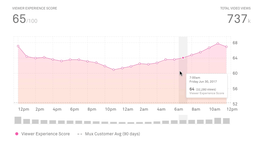
};What it ended up looking like
Honorable mentions
- Chart.js: As mentioned earlier, this was a great project that served us well. If we weren't looking for something that felt easier to work with in React we probably would have stayed here.
- Highcharts: Big, commercial, charting library. Seems great and people love it, but ultimately we saw the same issues here as with Chart.js. If we were going to undertake a big switch, we didn't want to keep a lot of the same problems around.
- DIY using D3 or SVGs directly: Ain't no one got time for that right now.
In conclusion
When starting to vet the different charting options there were illusions of blogging grandeur. Multiple blog posts with detailed benchmarks where we threw terabytes of data at charts until they crashed our browser and wrote up intricate examples using kitten-themed custom components everywhere. Then the actual work started and, well, we just needed new charts and we weren't using kitten-themed components or terabytes of data right now.
The TL;DR is, I don't really think you can go wrong with any of the graphing libraries we reviewed. Personally, however, I would suggest people looking for a React-specific charting library to check out Victory and Recharts first. Go forth and build amazing charts (or just sign up for Mux and look at ours)!
🖖 Matt