The application of statistics is undeniably useful in nearly all fields: it helps us better understand risk, untapped opportunities, and identify areas for improvement. However, some statistical measurements are more helpful than others, and inappropriate application of statistics can have dire consequences. The most overused measurement is the arithmetic mean (average). In nearly all cases you're better served by using percentiles instead of averages. At Mux we do the hard work of calculating percentiles for our most important metrics and would love to share some of our techniques.
What's Wrong with Averages?
Averages are useful when you don’t expect outliers. In this simple example, you’ve got 10 apples and distribute them equally to 10 people. The average gives identical results to those of the percentiles:
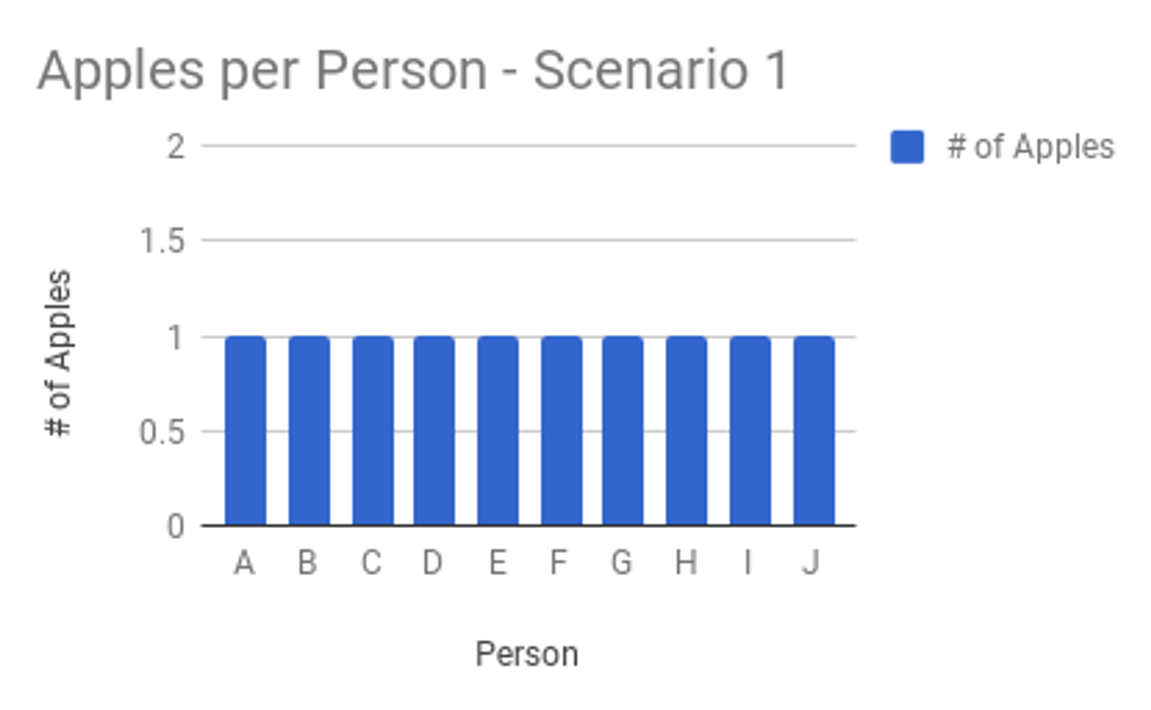
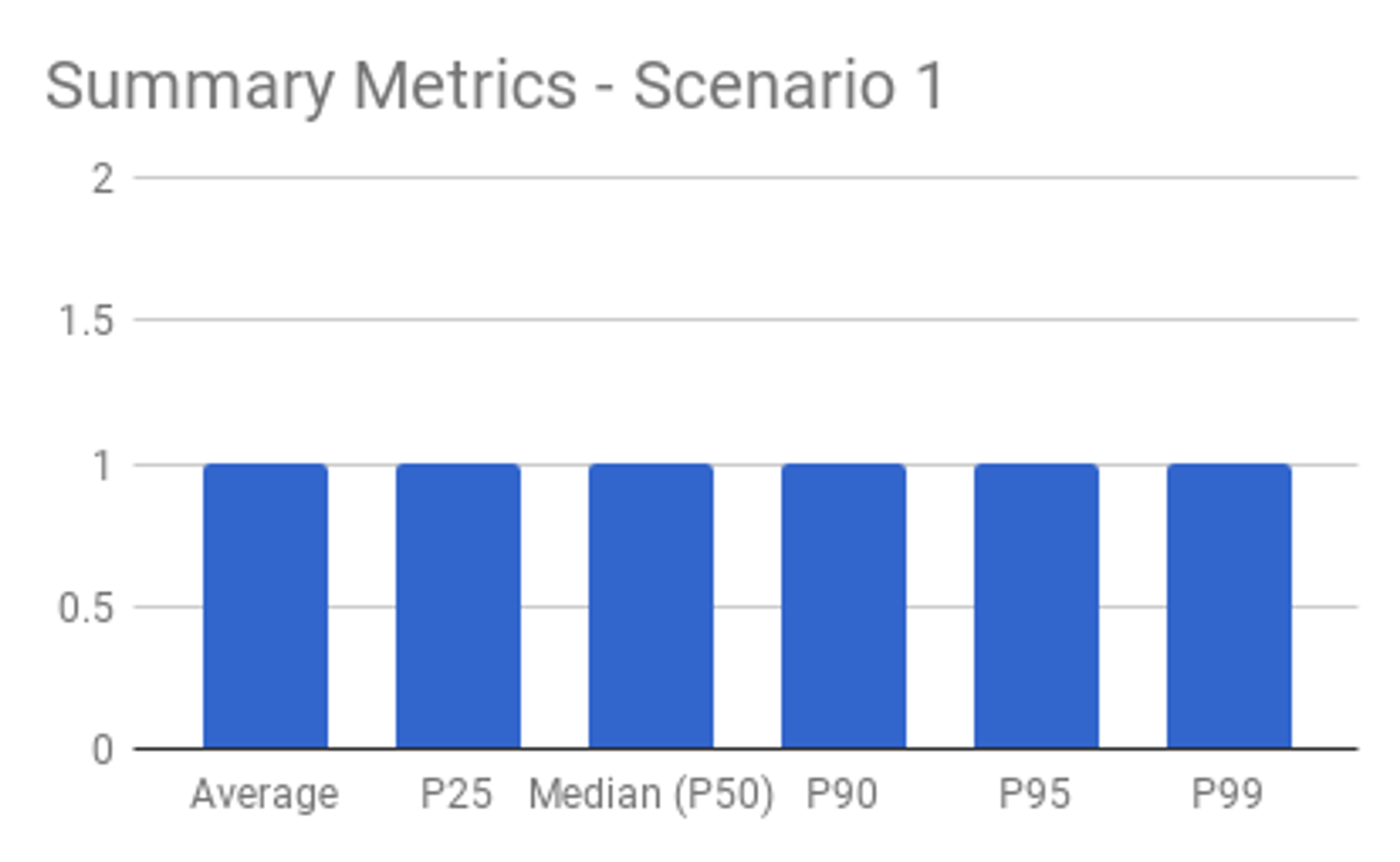
Averages hide outliers
Suppose you’ve got 10 apples and are instructed to distribute them among 10 people. Regardless of how the apples are distributed (1 to each person, or all 10 to a single person), the average remains 1 apple per person. An outlier condition, such as one person having all 10 apples, is hidden by the average.
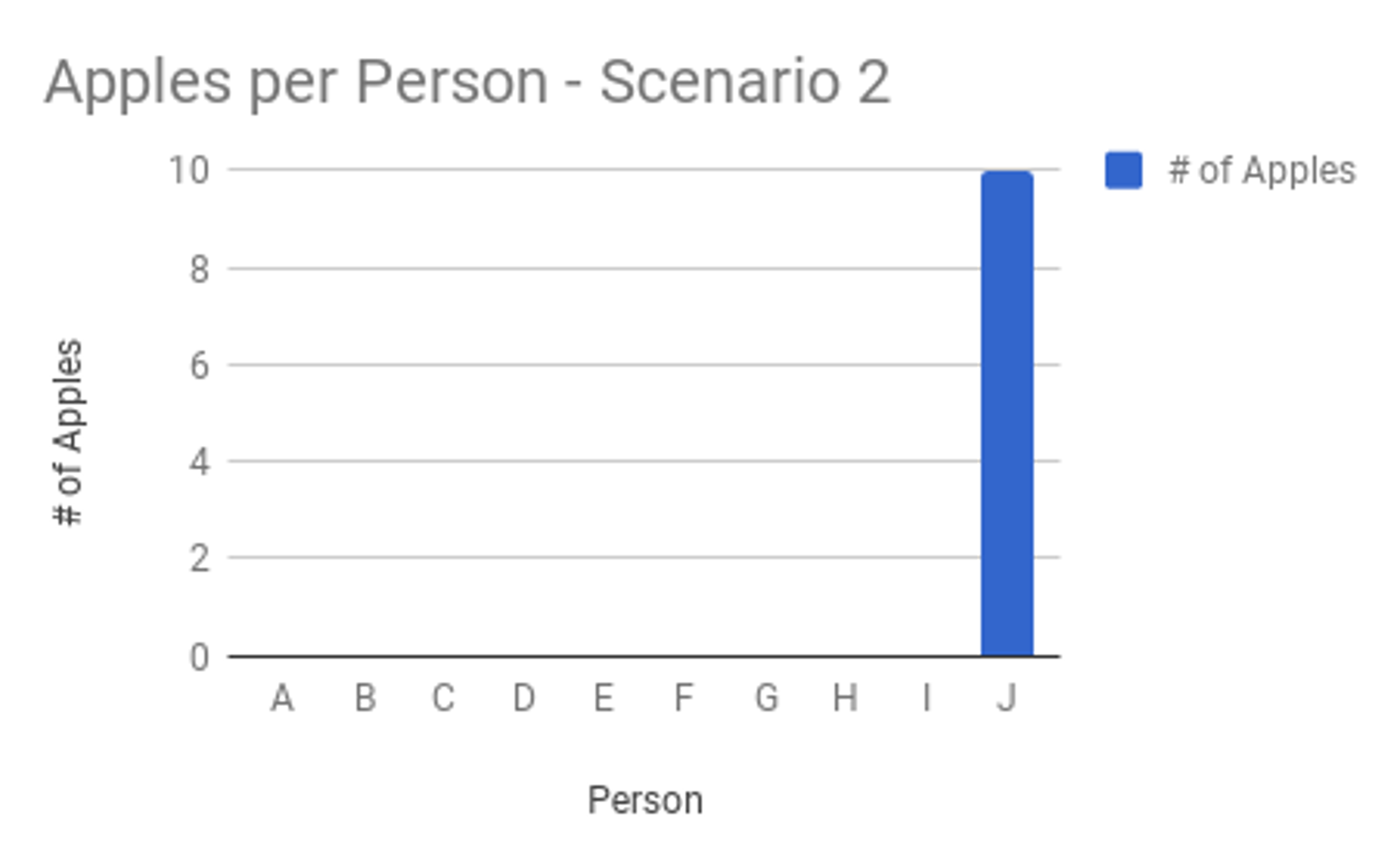
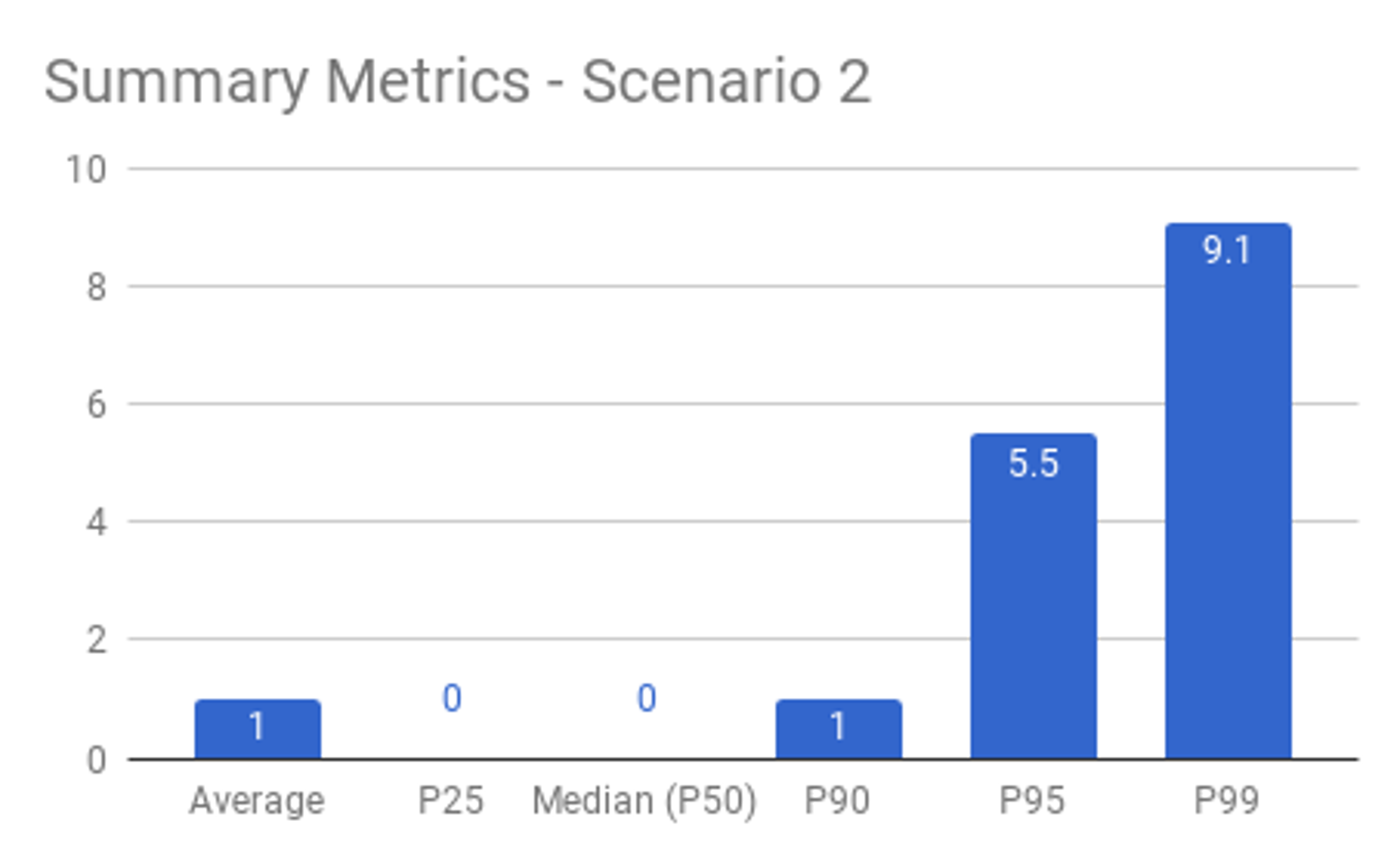
Averages mask typical behavior
Again, if you’ve got 10 apples and give 5 people 2 apples each, and zero apples to the remaining 5 people, the average is still 1 apple per person. However, the experiences of the people with 2 apples is vastly different from the experiences of the people with none. The typical experience is not obvious from the average.
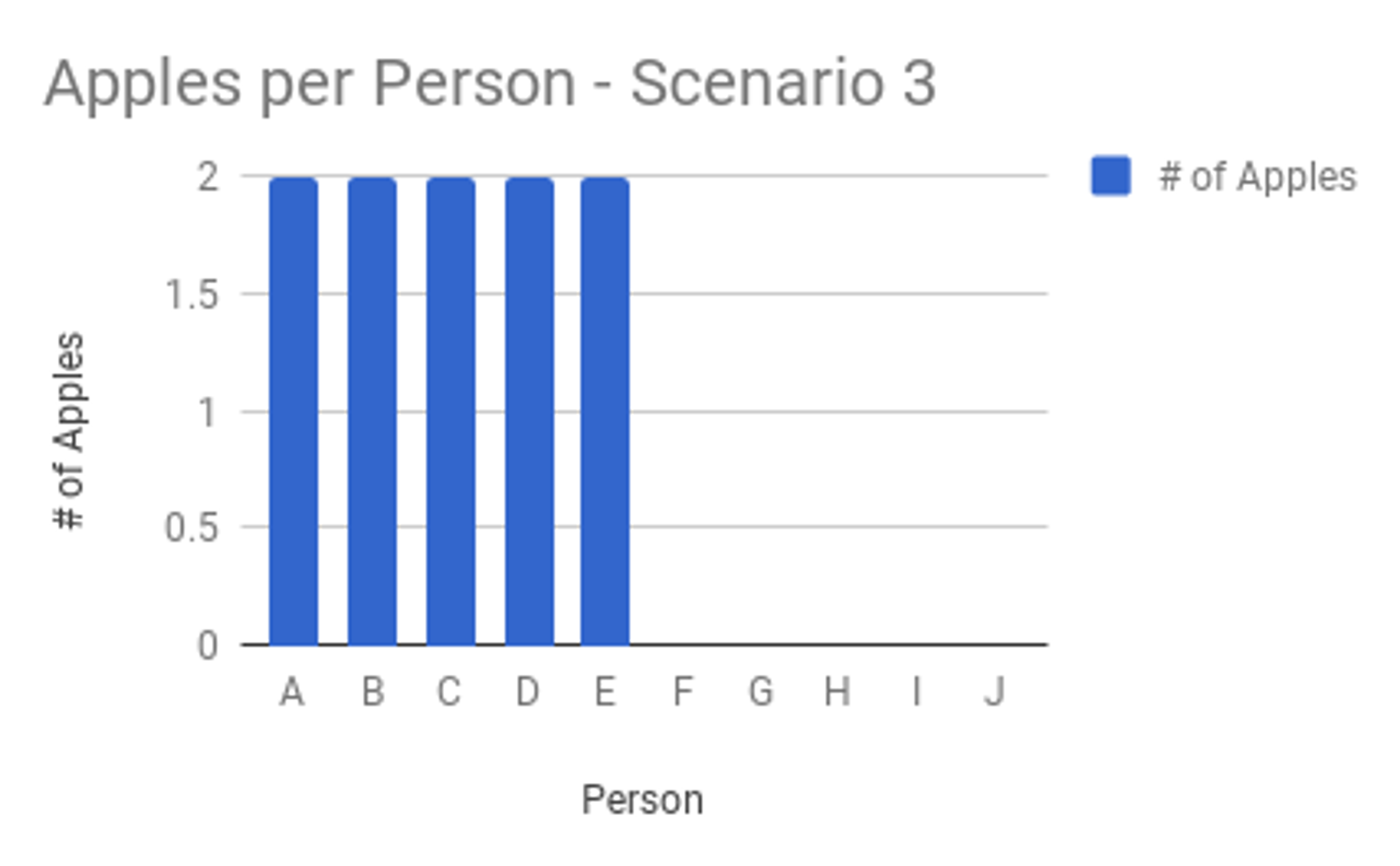
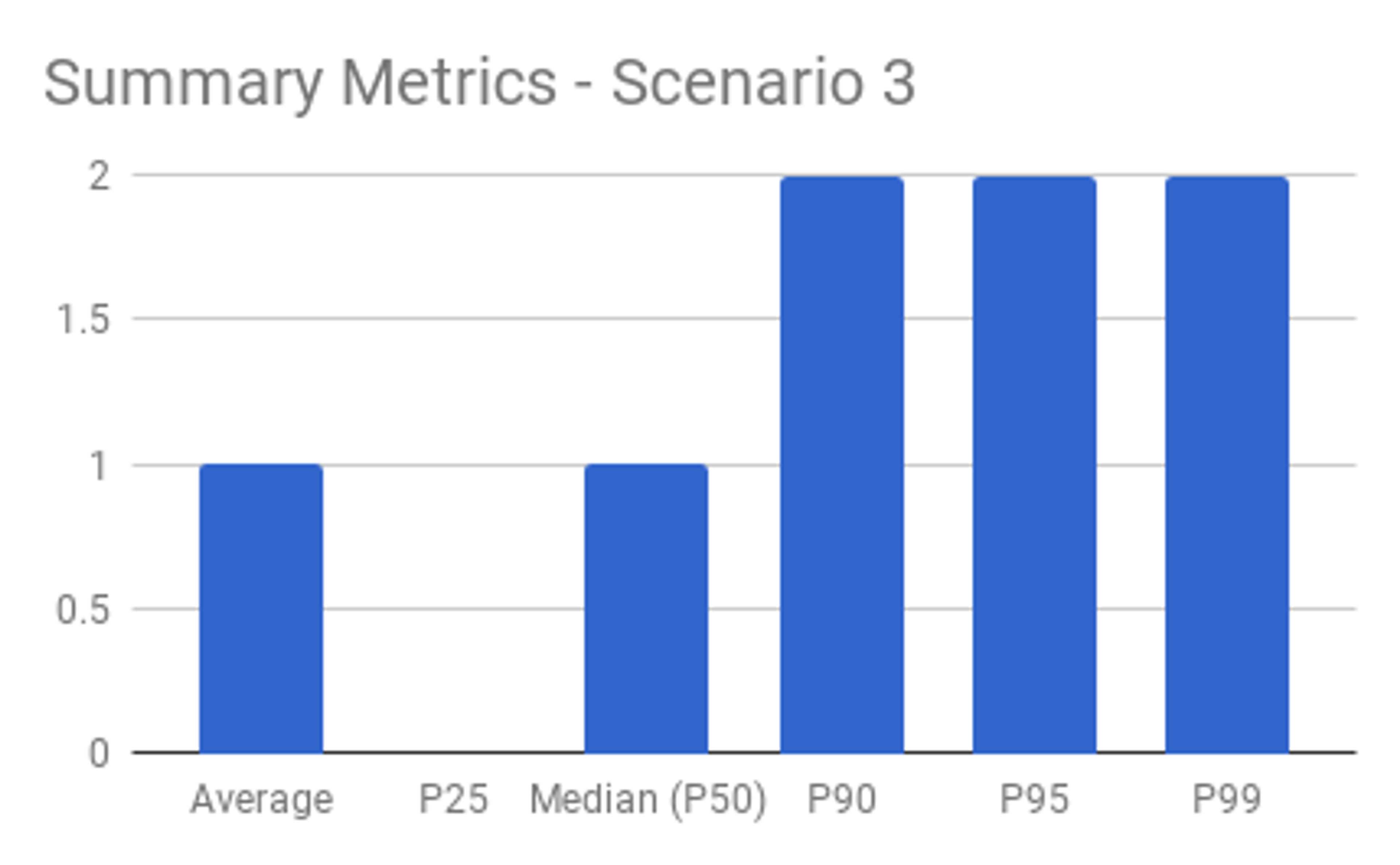
Percentiles, on the other hand, don’t have these shortcomings when viewed together. Outliers and the typical experience are evident when looking at multiple percentile calculations. This is why the Mux Data product calculates aggregate metrics as percentiles rather than averages.
Why doesn’t everyone use percentiles?
Calculating percentiles requires loading and sorting the entire data set. This can be CPU and memory intensive, depending on the number of measurements. Averages don’t require keeping the entire data set in memory during the calculation, and their values don't need to be sorted. This makes percentiles relatively difficult to calculate over a large time span for systems with many measurements.
Considering how resource-intensive and tedious percentile calculations can be in software, it's no surprise that averages are more popular among the general public.
How Flink Makes Calculating Percentiles Easier
Stream processing systems such as Apache Flink have become increasingly popular to manipulate data from streaming sources like Apache Kafka and AWS Kinesis. These streaming sources provide ordered, partitioned access to encoded messages.
Flink allows measurements to be accumulated using time-windows (e.g. 5 minutes) and counting-windows (e.g. 100 measurements). Computing percentiles over the window is easy. These measurements can drive subsequent actions in the Flink application or be written to persistent storage.
At Mux we’ve built several Flink applications that consume from Kinesis and Kafka streams. These applications perform anomaly-detection, identify video views with high beacon rates (i.e. bad actors), report on video delivery performance, and more using windowed data that yields measurements best represented using percentiles.
Example of Calculating Percentiles in Flink
Let’s build a Flink application that calculates percentiles for assignment of apples. Here's a flow chart of how the application should work.

We'll begin by defining a Plain-Old-Java-Object (POJO) to hold our metrics calculation results. Please excuse the setter-getter noise; this is Java.
For the sake of simplicity, we’ll make the input a simple integer and the accumulator a List of Integer values. In practice they can be any serializable Java objects.
Let's define an aggregate function that can add a single measurement to an intermediate collection and eventually calculate percentiles once the collection is complete. In earlier versions of Flink this was accomplished using a FlatMap, but they've switched to the more intuitive name AggregateFunction. We'll write a Java class that implements the AggregateFunction <IN,ACC,OUT> interface provided by Flink. The Apache Math3 library is used to perform the percentile, average, and range calculations:
Lastly, let's create the Flink application that wires up our Kafka stream source, aggregate function, and sink:
The application will print a JSON-encoded execution plan, which I supplied to the Flink Plan Visualizer. This yielded the following chart that matches up nicely with the flow-chart from earlier:

At this point you might be thinking "Okay, cool, you're doing percentiles for groups of 10 apples. How about 50? Or 100? Or all of the above?"
Easy, we'll fork the stream and perform those calculations in parallel:
Here's the execution plan for the parallel percentile calculations:
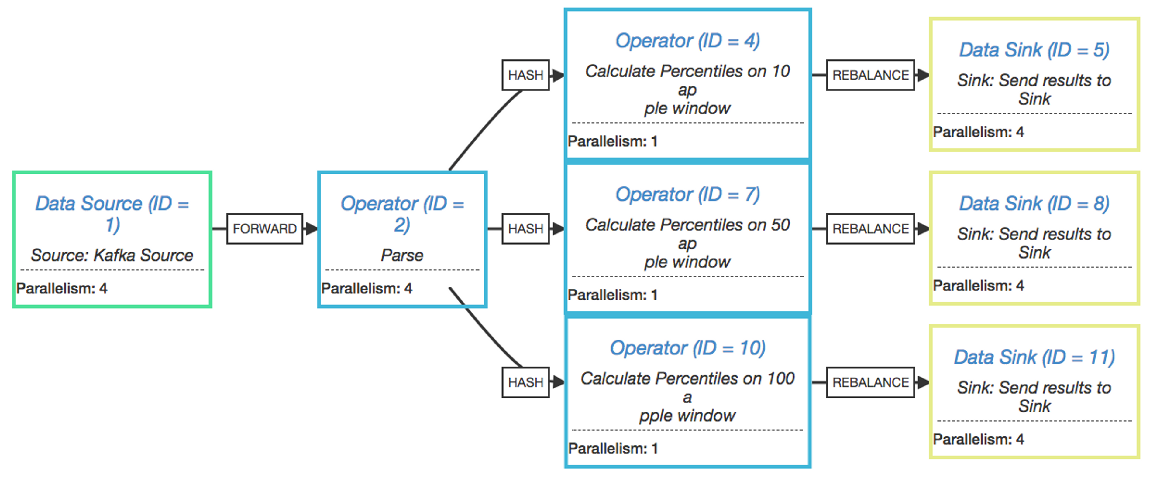
Calculating percentiles up-front has an extremely low cost compared to calculating percentiles on-demand across a large data-set. Flink only keeps the current windows of 10, 50, and 100 apples in memory. Once the percentile calculation is complete, the raw measurements can be discarded and a new tumbling window is created. A drawback is that you must know the various percentile breakdowns in advance. The introduction of a new window count or duration will yield percentiles only for new measurements, unless we’re tricky and replay past Kafka/Kinesis records to fill in historical data.
Conclusion
Percentiles are extremely helpful for identifying outliers and representing a typical experience in data that you expect to vary widely. We’ve found tools like Apache Flink helpful in simplifying the task of performing calculations on streaming data. The data processing pipeline in our Mux Data product performs this resource-intensive task to give our customers the best representation of what their users experience while playing video. We encourage you sign up for a free trial of Mux Data to see what you’ve been missing!
“The Outlier” by Tomošius is licensed under CC BY 2.0


