I don’t remember much about my first web design class. But I distinctly remember using the eyedropper tool in PaintShop Pro for the first time. I remember picking a color directly from a photograph on my page and then copy/pasting that hex value into my css and changing the text color for my *entire* website. What a rush. The ability to change how someone experiences reading on the web, no matter how small, is rewarding for a designer. Redesigning our corporate blog was no different. We had been dissatisfied with our blog situation for a while and we finally decided "Let's just design and build our own."
A small plan and a few design principles
I’m sure you can find plenty of content marketing pieces on “how to design the best blog” so I’m going to mostly skip process stuff. *But where and how should I begin?* I always get paralyzed by this question so my only guidance on process comes from a John Cage quote:
“Begin anywhere.”
And we did just that. We got our small group together and asked what objectives we had for the blog and what our guiding design principles should be. Next, Dylan (my developer counterpart for this project) and I jumped into our separate workflows. He started on the backend and migration process (you can read about that here), I worked through the designs, and we removed blockers for each other along the way. We had four design principles that guided us:
- Reading experience above all else
- A mobile-first reader’s journey
- Typography over images
- The writing process should be easy
(1) Reading experience above all else
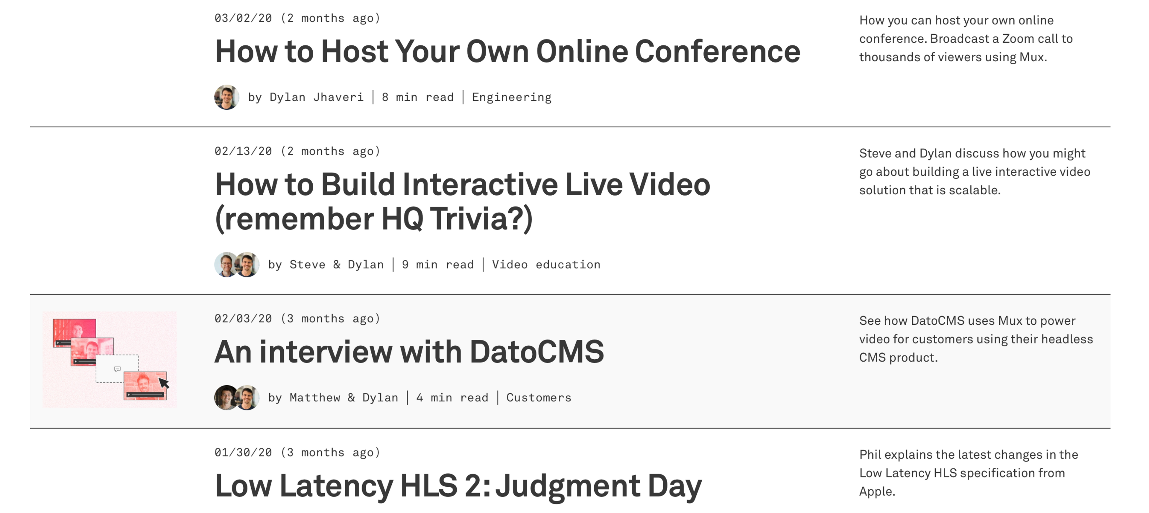
At Mux we spend a significant amount of effort writing blog posts. It’s one of the main ways we communicate our ideas and share new features. We’re writing deep technical posts and well thought out stories, not listicles that people skim to look for images and links. The content has to be the focus. Not the CTA’s, not the signups, not the subscribe forms. Our audience is made up of developers and video experts, people that want to read thoroughly and not be interrupted.
This might seem like an obvious goal when designing a blog but if you spend time looking around at corporate blogs it’s clear they have a lot of other competing goals. The thing about designing a good reading experience is that it’s mostly just saying no to things.

A good reading experience for us looks like:
- No obnoxious CTA’s, especially ones that happen mid-article
- No social sharing icons (does anyone actually trust clicking one of these?)
- No thin, light gray fonts (our old visual identity loved these). Instead we’ve moved to larger text sizes and darker colors for better accessibility.
- No comments or disqus, we’d rather discussions happen on places like twitter or hackernews (pro tip: you’ll want to have strategies in place to prepare for this wild beast)
- Yes to subtle queues like read time and progress indicators (great for reading long posts on mobile)
Okay, sounds idyllic and all but we’re still a business and we have goals to hit with our website. So assuming people do have a good reading experience, what should be next for them? What are the ideal actions we want them to take?
- Drive traffic to mux.com. This surprisingly was a big problem with our old blog. The template didn’t allow us to design a nice/intuitive navigation experience that integrated closely with our normal website. Readers are often new to Mux and want to learn more about our company but previously they didn’t have an easy single-click way to get to mux.com.
- Share it (with a colleague or on social media) Some of our most successful blog posts are often ones that have made the front page of hacker news or get circulated internally at companies/teams we think highly of.
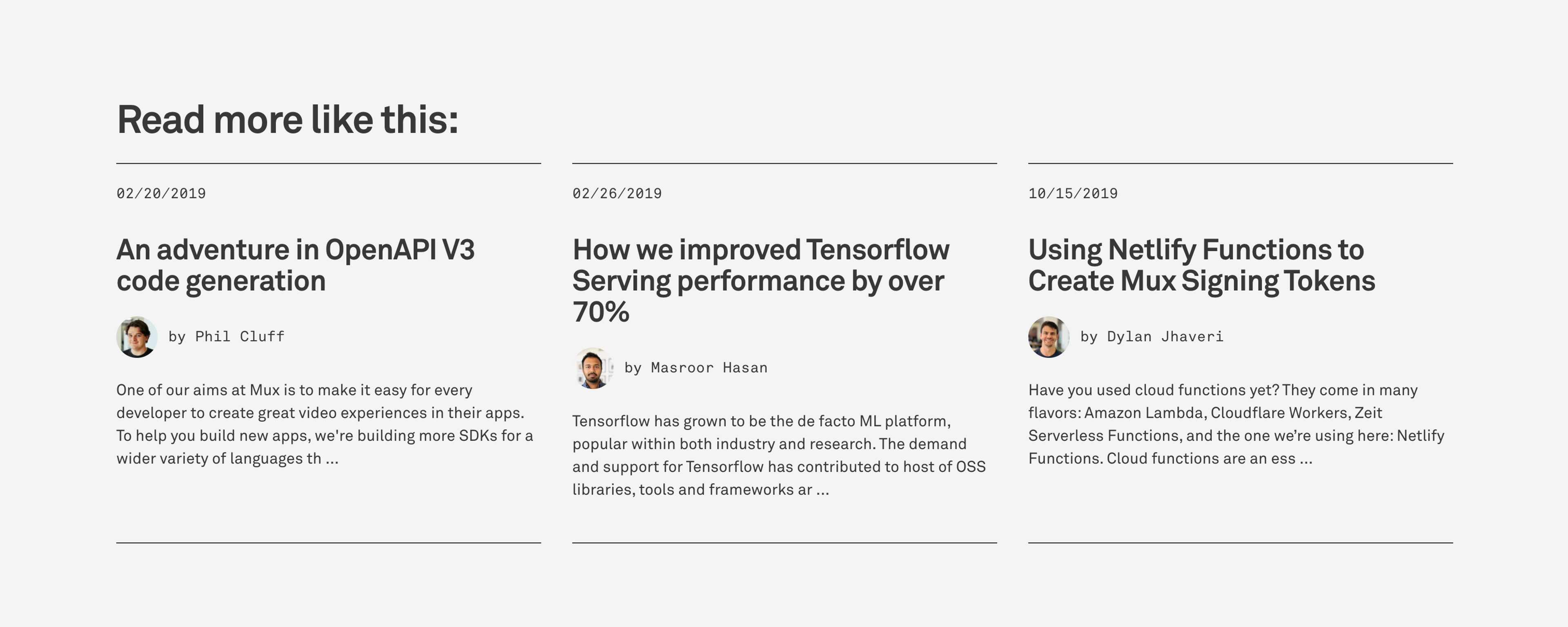
- Read more of our writing. Pretty straightforward. If the reader likes our writing we want them to find more of it.
- Subscribe to our newsletter. If the reader enjoyed what they read and wants to stay informed on what Mux is up to, enter the good ol’ newsletter.
Now this is where I think a lot of blogs get it wrong. They look at this list of actions as just that, a list. They figure out how to make all of these actions available to the reader at the same time but really these actions all have very different places in the reader journey and require different context. Our second design principle helped us break up these actions and figure out how to sprinkle them throughout the reader's journey.
(2) A mobile-first reader’s journey
The common occurrence of opening a blog post from twitter was reason enough to focus on a mobile-first approach but it also helped us exercise constraint when starting to design. It’s very easy just to glom all the actions together into a spacious desktop experience. So before starting any visual design I created some really simple wireframes (adding desktop as well) to help us answer the “where do you want to go from here?” question for each part of the reader journey.
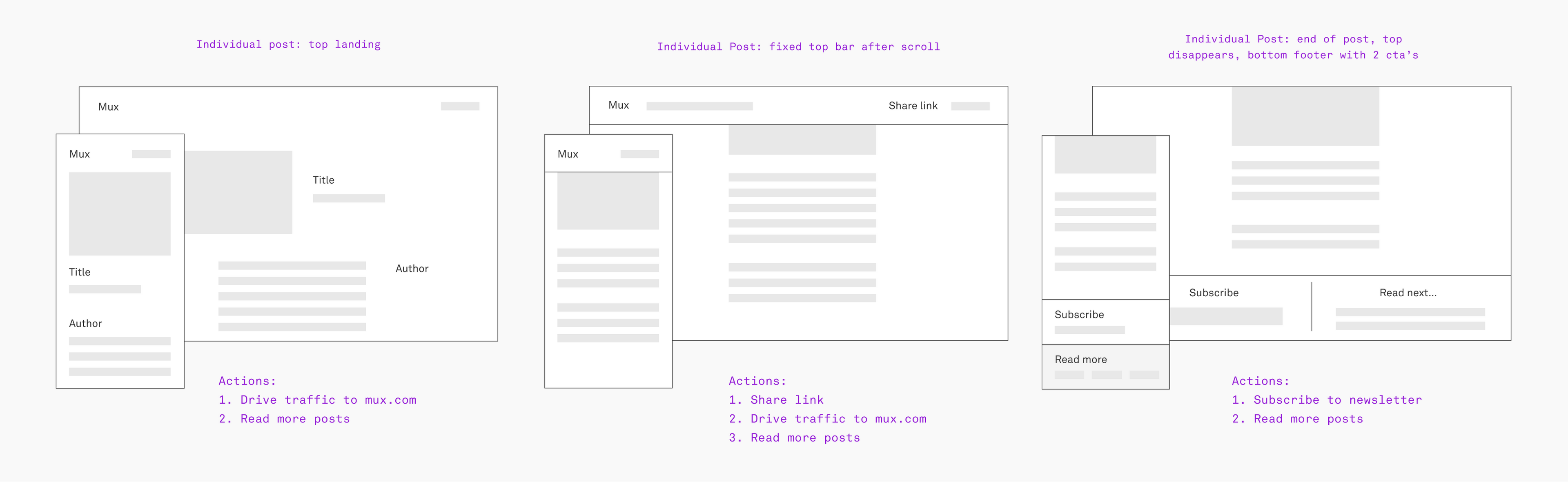
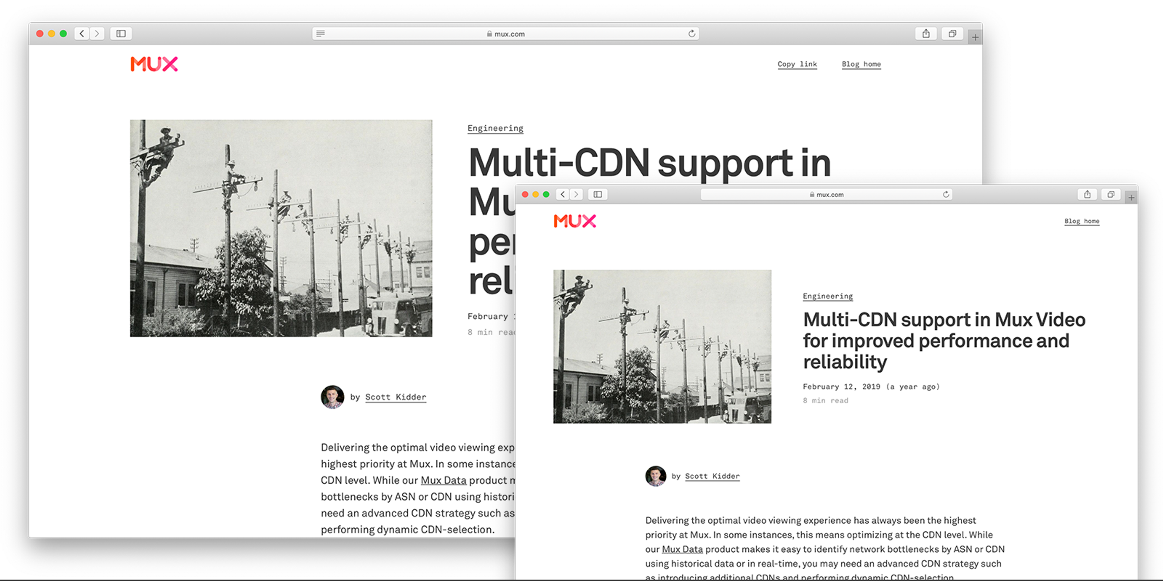
Let's start at the top of an individual post: Arguably the most valuable section. It’s also the section that’s easiest to clutter with that extra junk we talked about. If readers don’t make it past this section and actually read the article what would they care about at this point? One common scenario is a viewer who isn’t interested in reading right at that moment–maybe they just want to see who Mux is or maybe they want to see the blog overview to see what we write about. This was where it was important to have a link to our main website as well as the blog home/overview. Another scenario is the return visit from someone who remembered the post from before and wants to verify it before copying the link to share it.
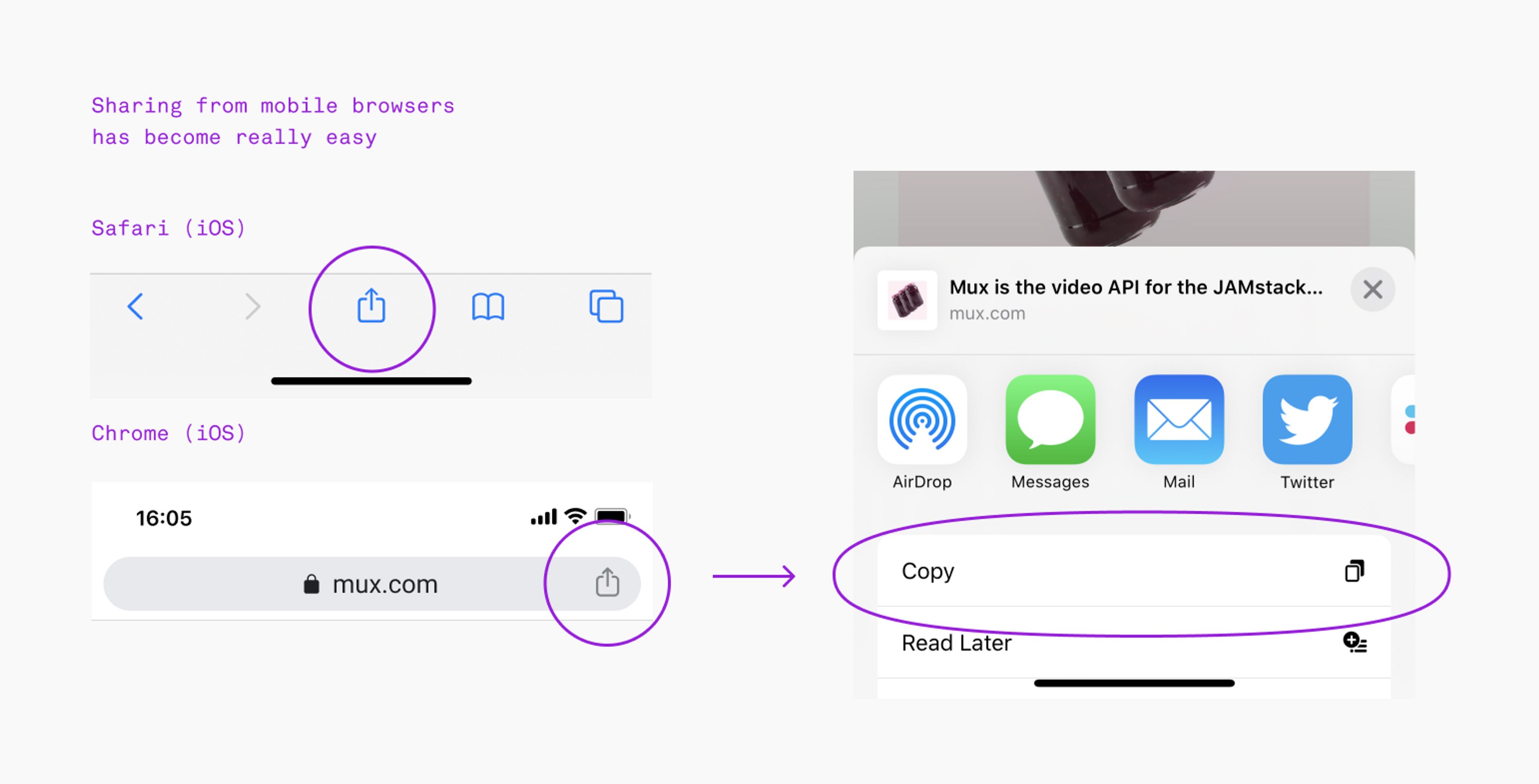
Halfway through: People form opinions early and share articles before they’ve finished reading. We all do it. To share something you need the URL and most developers (myself included) are going to delete those junk tracking parameters added to the end so let’s just agree to not do that. We stuck with a simple, click-to-copy button that gives you the base-only url.
However after testing it first on mobile I realized the most common mobile browsers (Safari and Chrome) now have easy “Copy Link” options that only require only two taps. We ended up removing this from taking up coveted mobile real estate.
When you’re halfway through reading a post, it may be likely that you forgot the title of what you’re reading and when you share it, you’ll want the title for context. We figured if we added the title in a fixed nav bar there would be no need to scroll back to the top and get distracted. Again, this was not needed on mobile as you see a bit of a link preview after tapping the share icon.
Those wonderful people that made it to the bottom of the post: While this is likely our most engaged viewer it’s rare that someone is ready to sign up for a product trial immediately after reading a blog post. The more likely scenario is that they’ll visit our website to learn more about our products, perhaps read more of our writing, or look for a way to stay informed to get more of our writing in the future.
Moving beyond the mobile
The nice part about nailing the mobile experience first is that it allows you to use your desktop space in more interesting ways like expanding the width of components that can really take advantage (e.g. images, code blocks, data tables).

Because you know, it’s free real estate.
(3) Typography over images
The aesthetic choices for our blog design were mostly inspired by editorial publications rather than other corporate blogs. A problem I started noticing was that a lot of the editorial and blog examples we liked relied on commissioned art and photography or an in-house illustrator to design cover graphics. As a small startup without access to any of this, I chose to lean heavily on typography to evolve the aesthetic we started with.
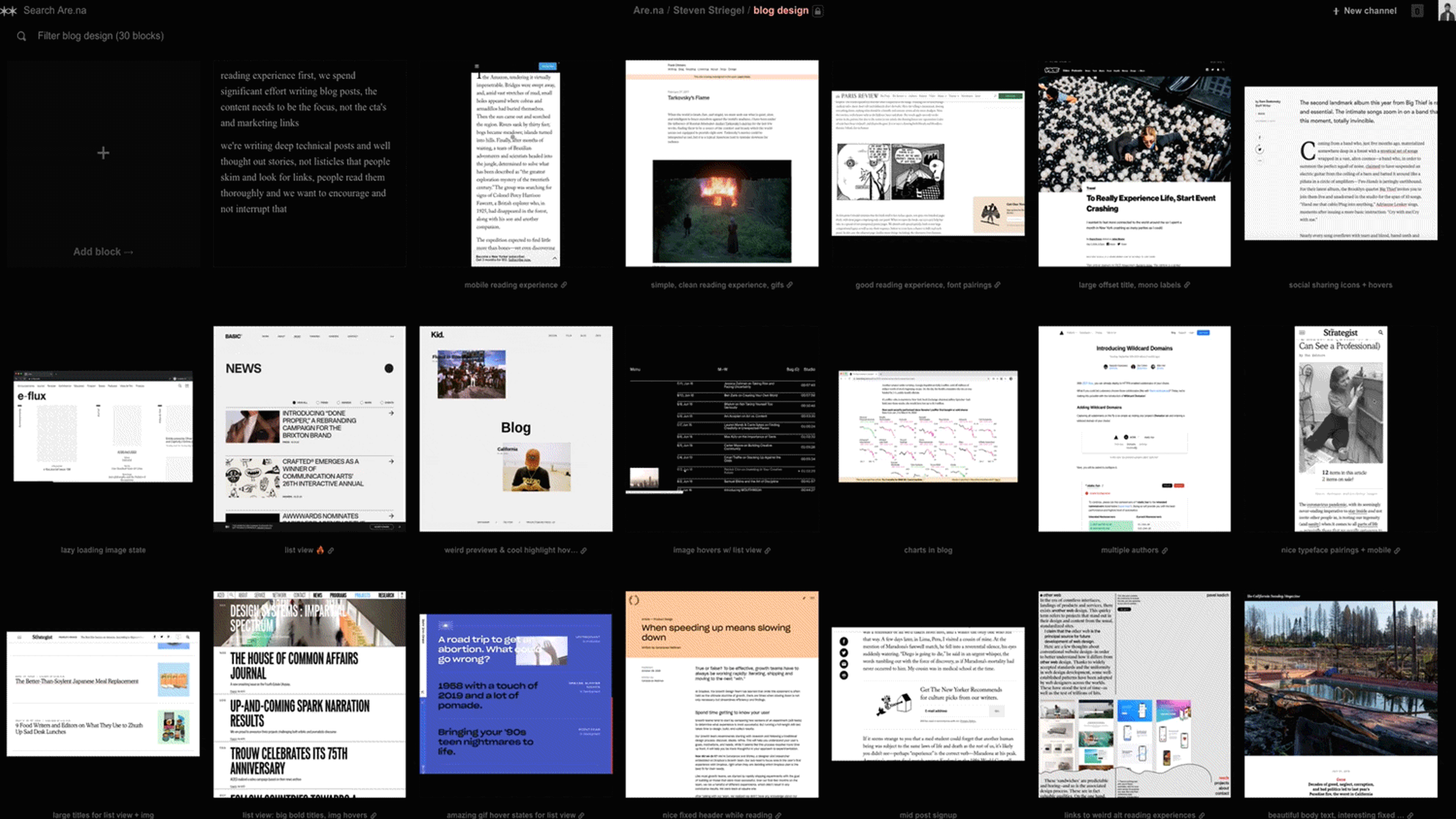
I created an are.na channel to collect layouts, interactions, and type treatments that we liked
We’ve been using the Akkurat typeface from Lineto since early on. Early on however we used the thin 200 weight of Akkurat and, when combined with our light grays, it became very inaccessible. Instead we’re now applying a big bold treatment which really embraces our direct and occasionally cheeky blog titles. Balancing this with the technical aptitude of Akkurat Mono for annotating details makes for a solid pairing.
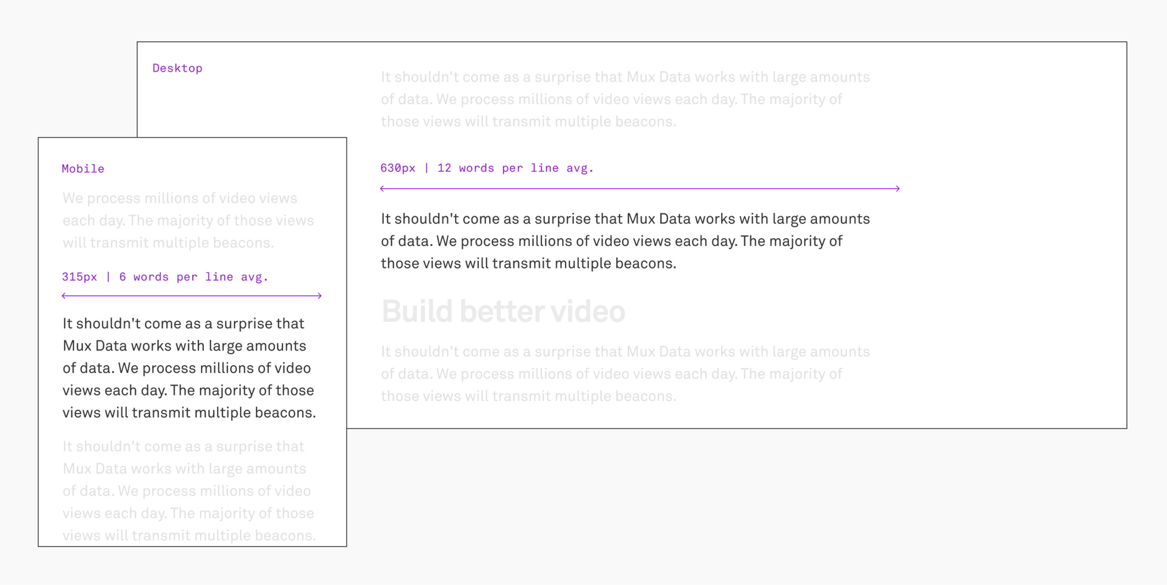
Visual design: Starting with the body text
The obvious starting point for the visual design of a blog is the text body. It’s the main vehicle for the words and everything else is there only to support it. The width of the text body is usually determined by a combination of type scale and readability. I generally shoot for an average of 12 words per line on desktop and cut that in half for mobile.
Type scales
What is a type scale and why do I need it? If you really want to understand the math and aesthetics behind type scales, learn from an expert like Tim Brown. My oversimplified takeaway: for visual consistency you want to limit the number headline sizes you use and why not base those choices off of a natural, mathematical scale that looks nice visually. It’s less about “this should be an H1 vs an H2” and more about here’s a multiplier to give you a list of steps you can choose from. Steps that we already know will look good and keep us consistent. Luckily there’s a handy little online tool to help you out.
Full disclosure: while designing our type scale last year I used this tool more as a guide than as a hard set of rules. Asking my engineers to deal with arbitrary decimal places felt silly. After reading Frank Chimero’s excellent deep dive on his own redesign process, I felt reassured *this was okay* 😅
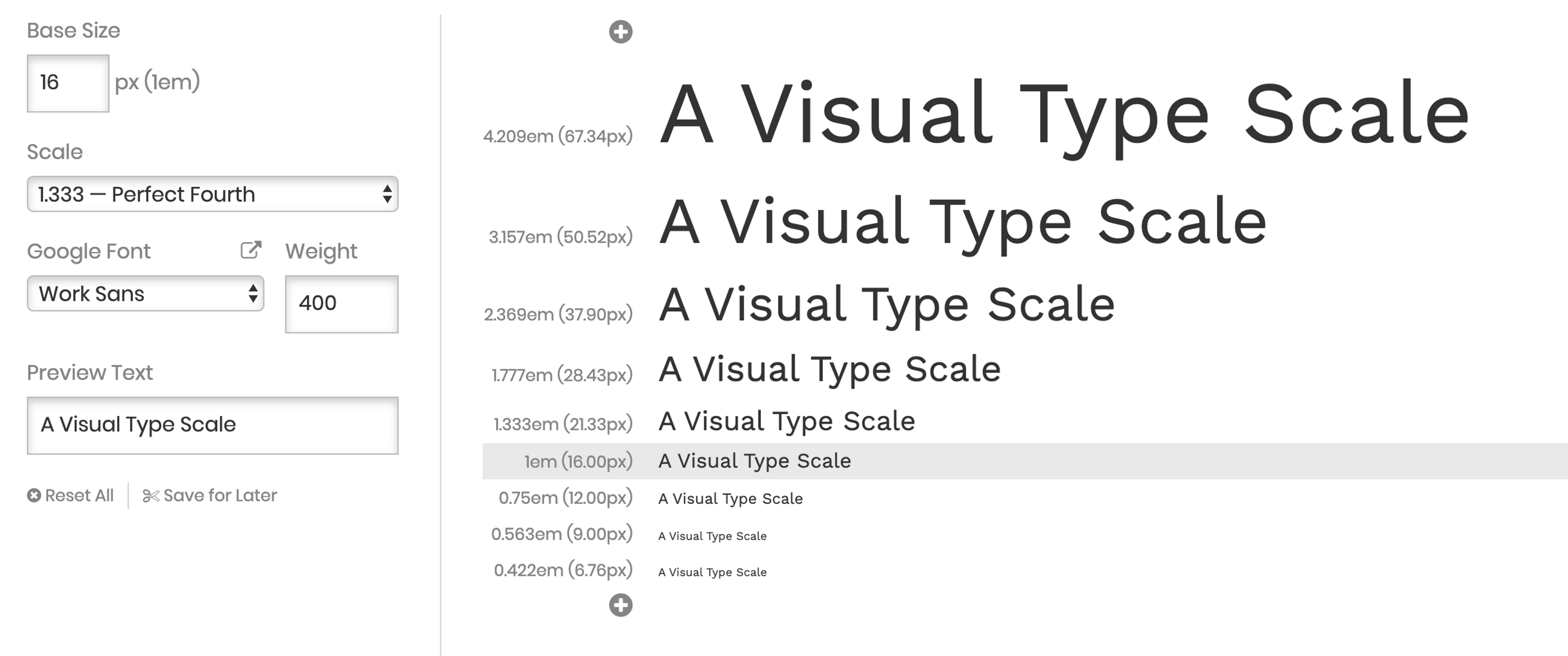
Mux “perfect fourth” type scale (1.33x):
67 / 50 / 38 / 28 / 21 / 18* / 16 (base) / 12
*wait, 18 isn’t on your “Perfect Fourth” scale! Nope, it’s not. But I wanted the blog to be larger and distinct from the rest of the website and guess what, it just looked good after eyeballing it. As I said before I think it’s OK to break seemingly arbitrary rules as long as there’s at least some intention behind it ¯\_(ツ)_/¯
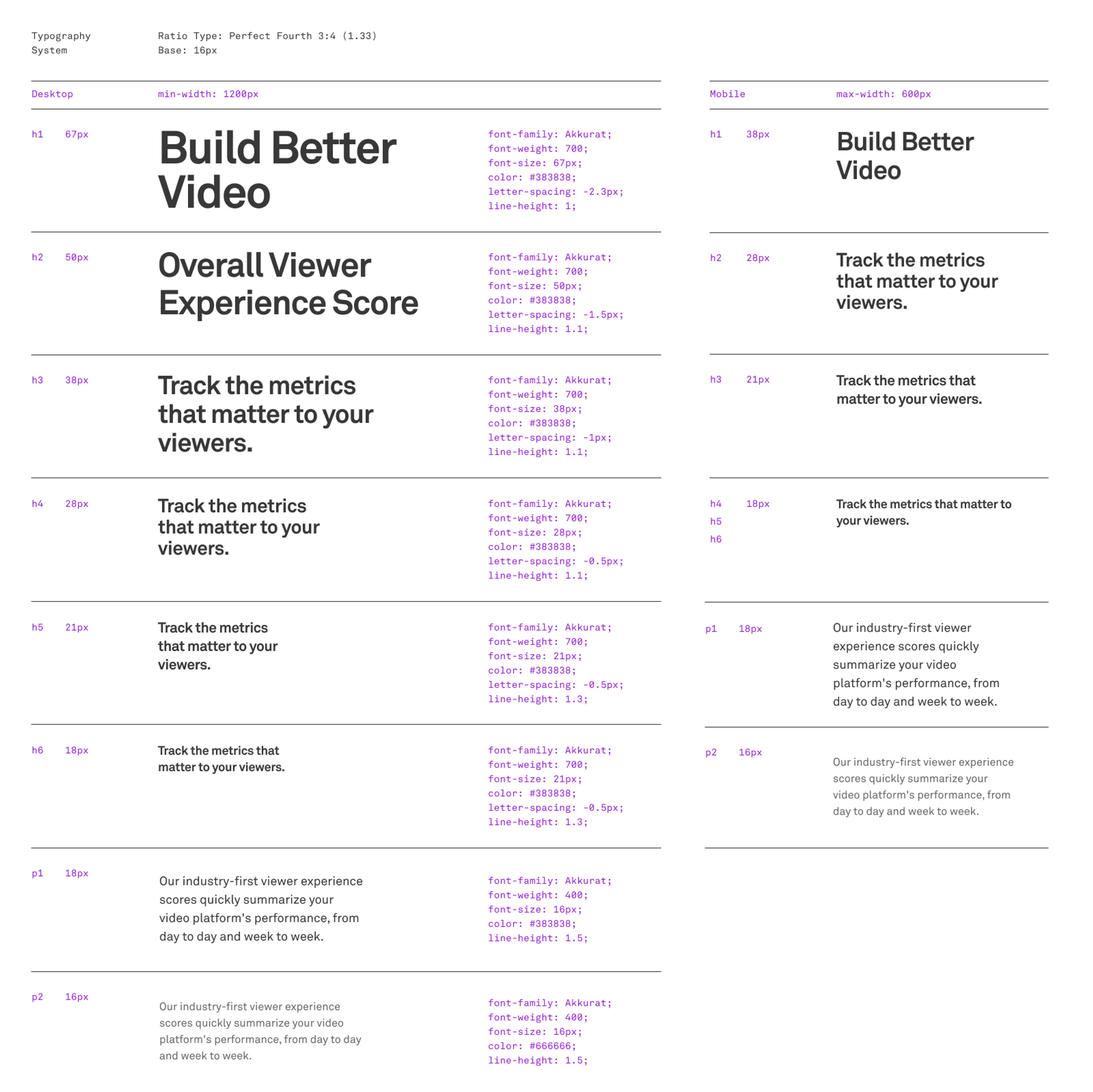
Here’s a static image of the full Mux type scale I designed (soon to be applied to the rest of mux dot com)
I want to address one quick subject on line height: somewhere along the way the generic 150%-is-the-most-readable-line-height rule has been ingrained in every developer’s head. This is merely a suggestion which applies only to body copy where you have lengthy text in generally small sizes. Larger display fonts need much less line height because you’re reading them as a single package, i.e. a headline which is not a continuous reading experience.
The prototyping process
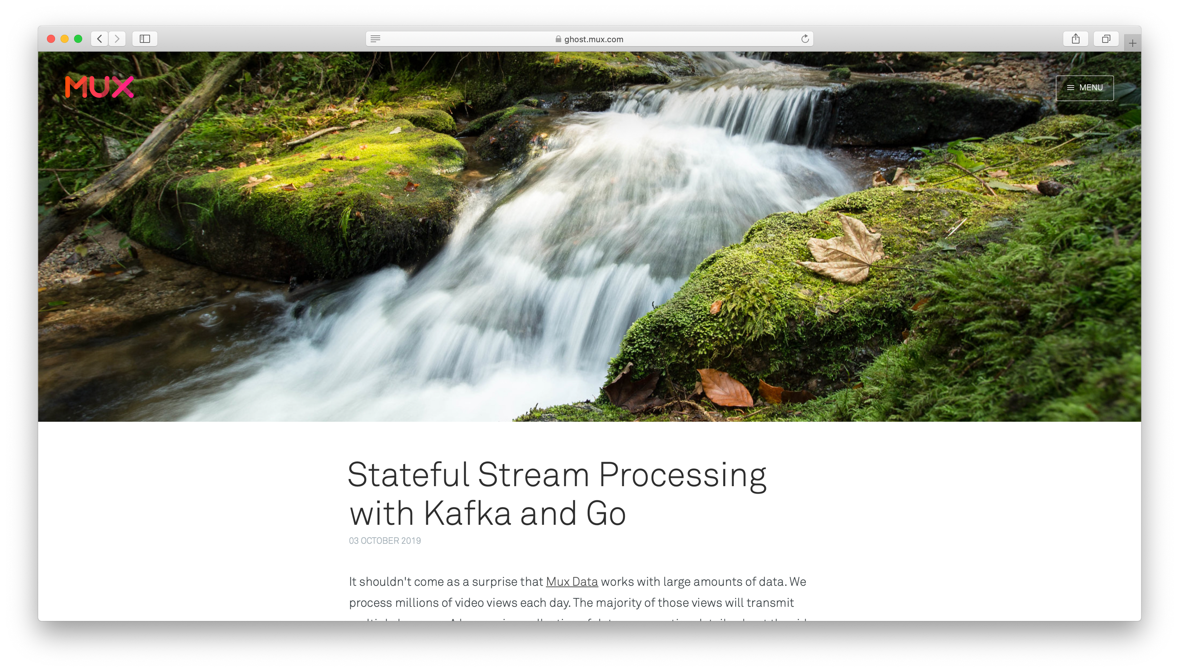
Mockups can only tell you so much about how well a design will work with such a wide range of content. Crazy long titles to three word titles, small gifs to wide aspect ratio cover images, code samples, multiple authors, etc. There was so much to visualize and I couldn’t predict how all of the content would respond. Our prototyping process was done more on the front end than with design tools. Because Dylan was able to migrate our old blog post content quickly, he was then able to build quick front end prototypes where I could inspect the elements and tweak things in Chrome’s dev tools to see how it felt. Sitting right next to each other* and going back and forth on nuanced details made this actually kind of fun and allowed us to perfect those small details that are often ignored. *Before you get concerned about social distancing I should add that this was clearly a pre-covid world and as much as I like to see remote work prosper, I definitely miss the ease of collaboration that the office allowed.
An early mobile prototype to test the visual design of the reading experience
(4) The writing process should be easy
I initially wanted this last design principle to be ‘Make writing enjoyable’ but let’s be honest, writing is hard. It’s not going to be enjoyable for everyone. Instead, we focused on improving all of those little inconveniences that make the process so frustrating. We figured that simplifying the workflow of getting a blog post out would be a huge win in itself.

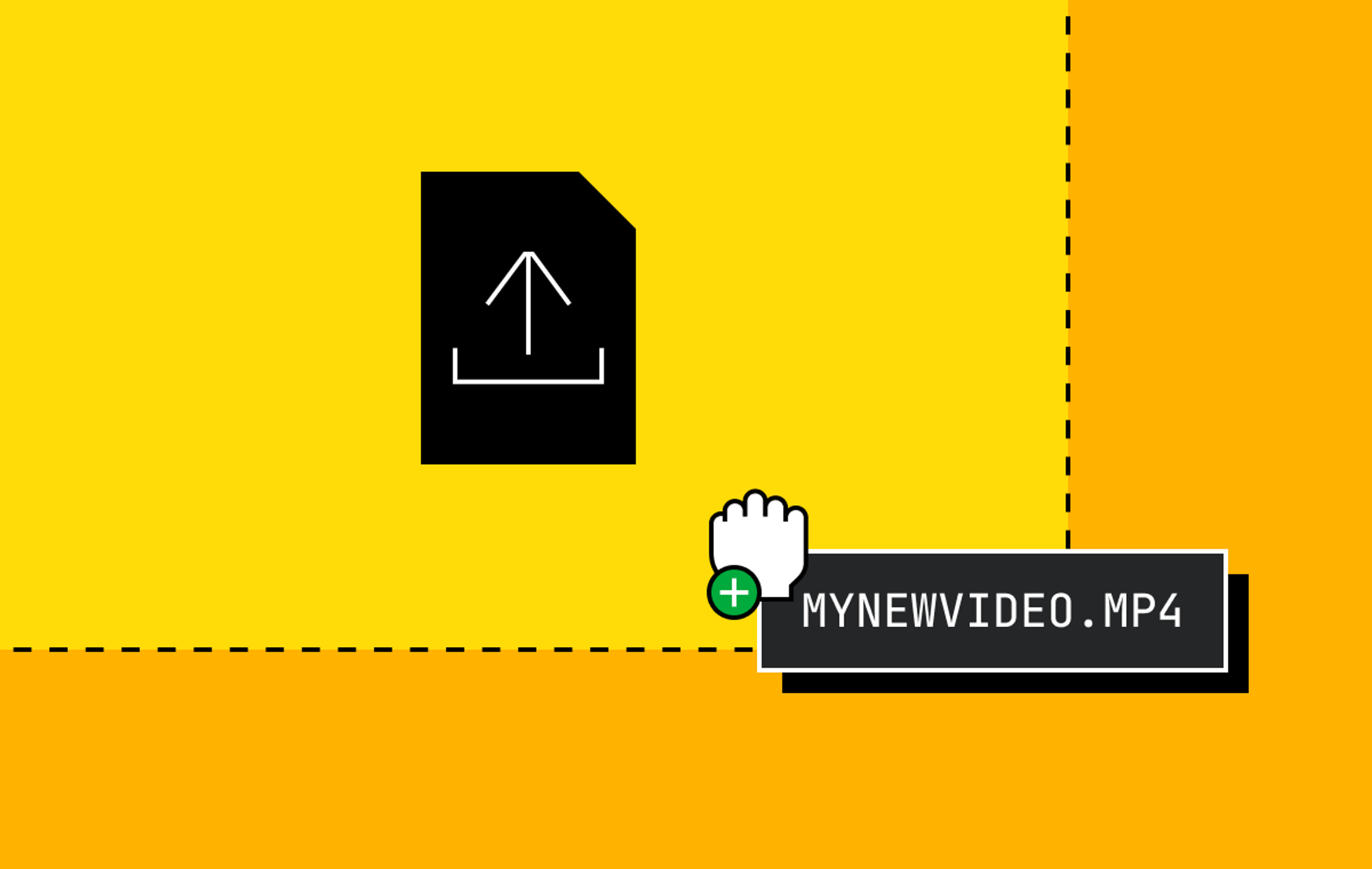
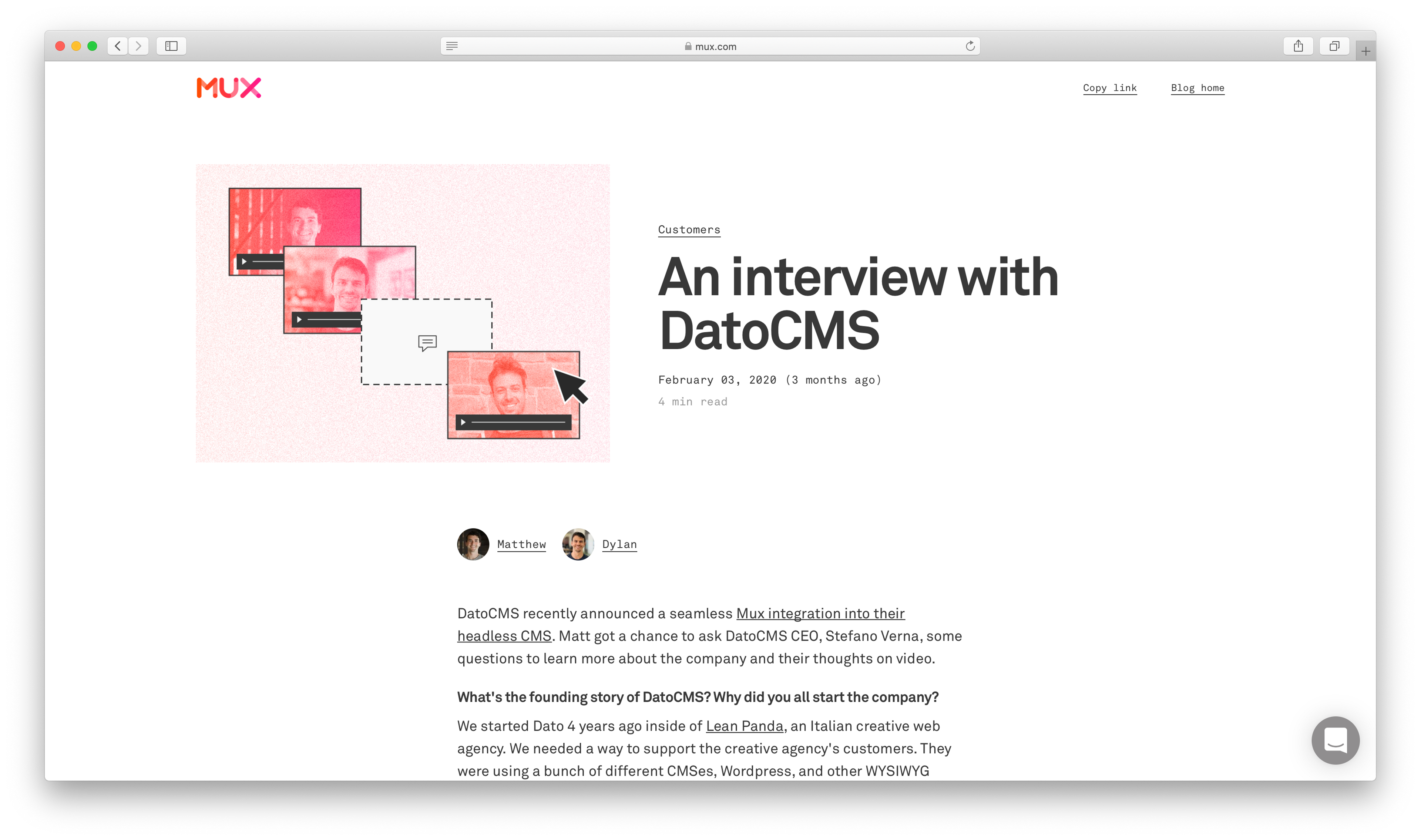
Cover images
This is always more of a struggle than it needs to be. Many blog templates have cover images as these big, beautiful full-width placeholders. This can put extra pressure on the writer because it makes the image that much more important. Instead we made them a more manageable, flexible size and put them right next to the title to help add context.
^^ Our previous approach (and most blog templates): “Hey add a photograph of something beautiful that will take up half of the opening landing page and be the visual representation of your writing. No pressure. Oh and source it on your own and make sure it works with other elements on the page like the logo.”
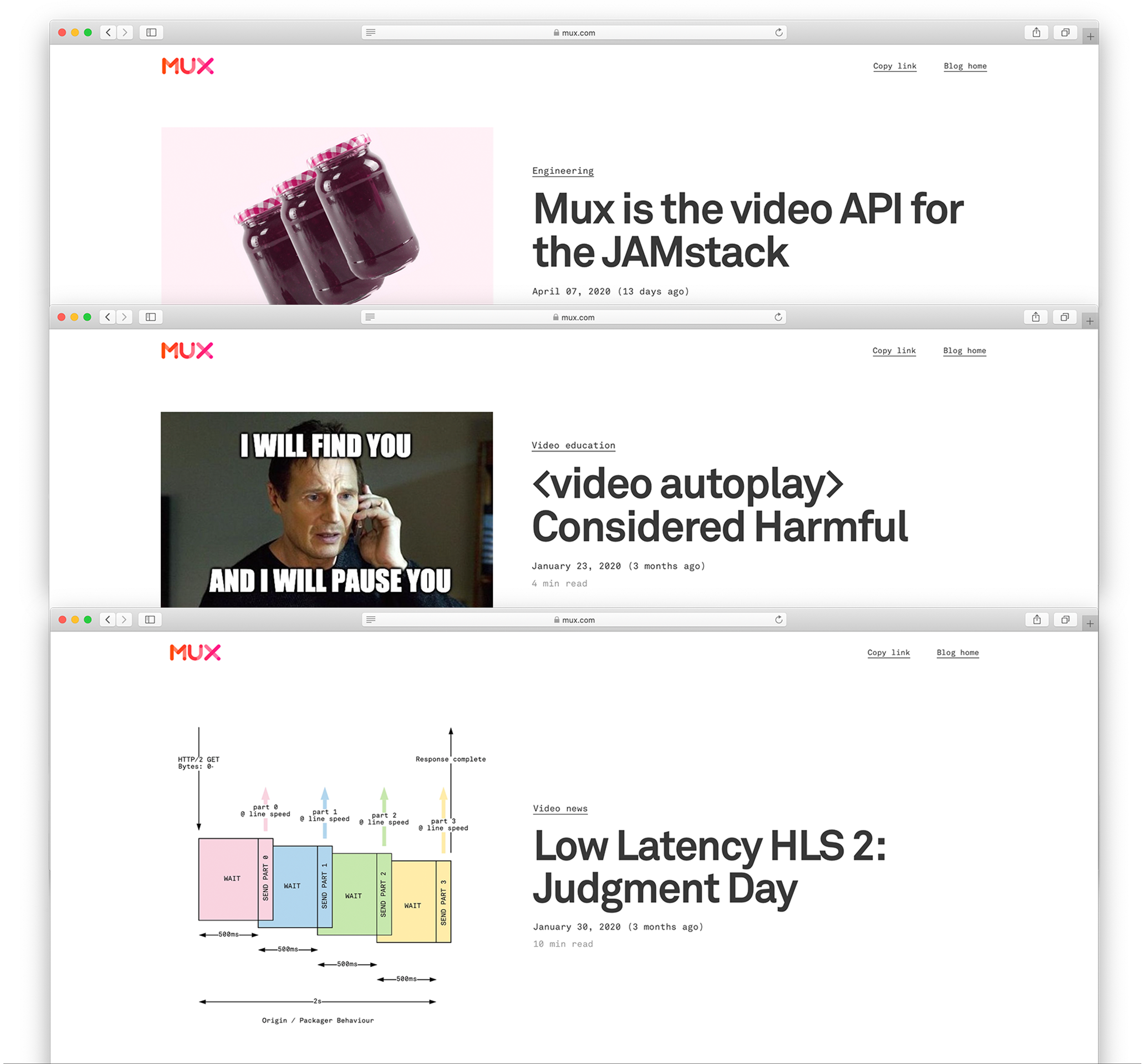
^^ Our new approach: Add whatever image works for the tone of your post. From gifs of memes to technical diagrams, our new layout will make it work and keep it alongside your title for context.
Knowing exactly how your post will look
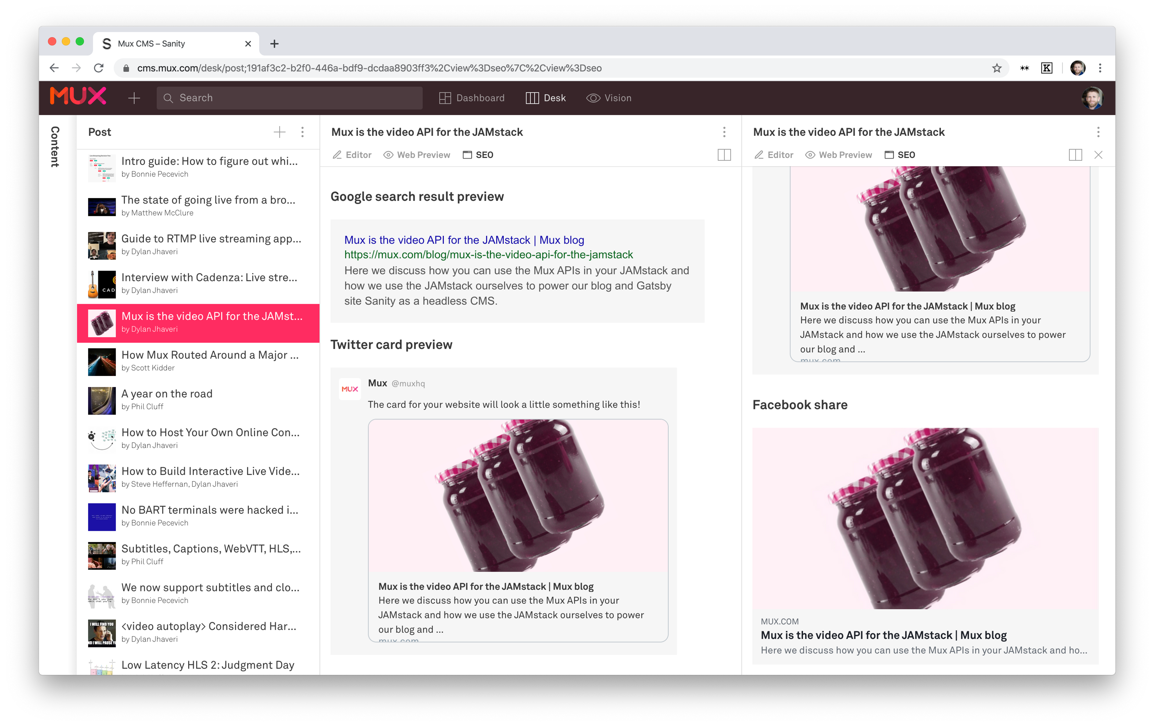
How and where your post is viewed determines if it gets clicked and read. How will this look in search results? How will this look on Twitter? Is my title too long? Is my image too obscure? What will it look like if viewed in this very-specific way? All of those little unknowns can be crippling for a writer.
Not only did Dylan build a nice web preview but he also added SEO previews right in the CMS.
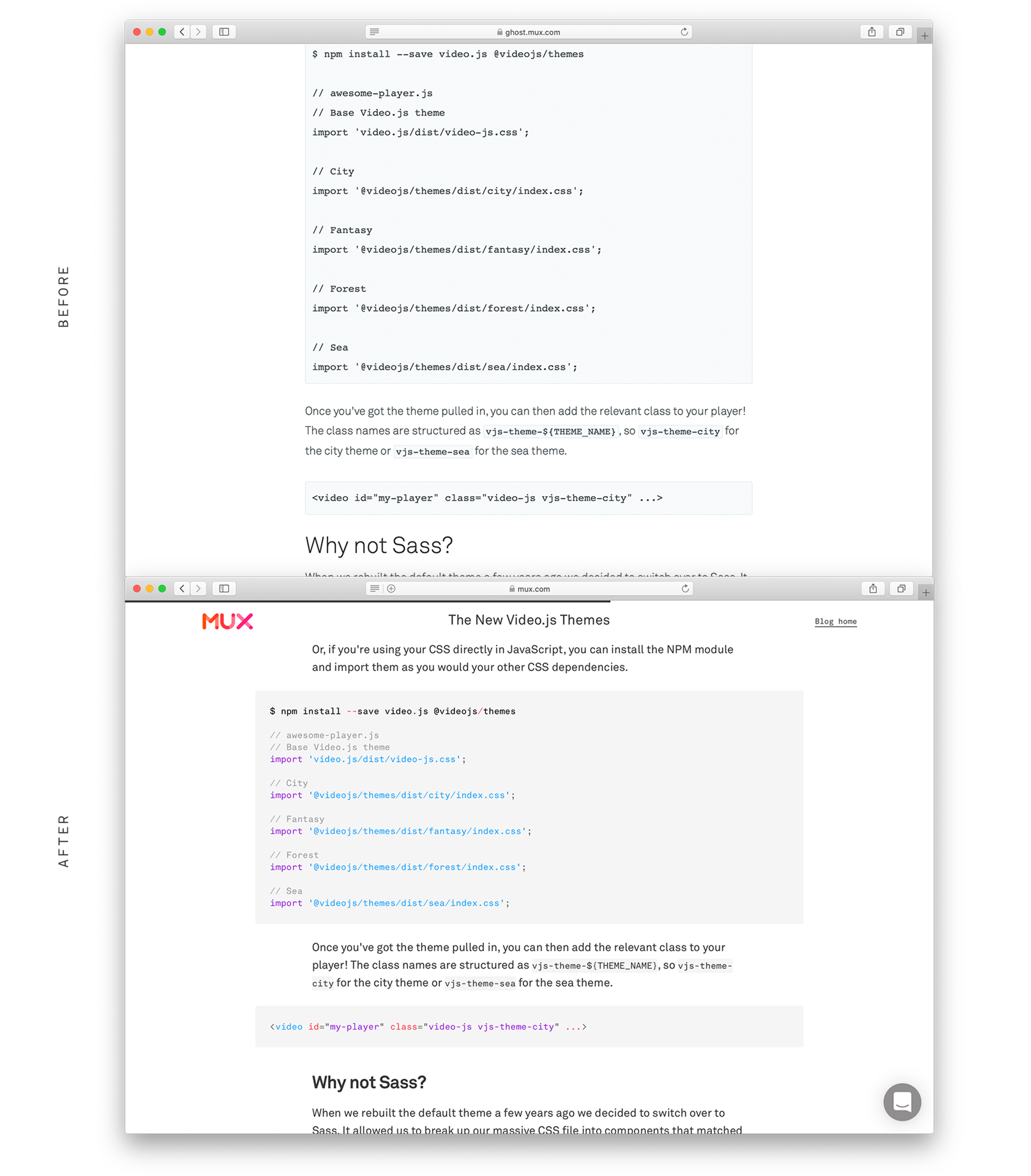
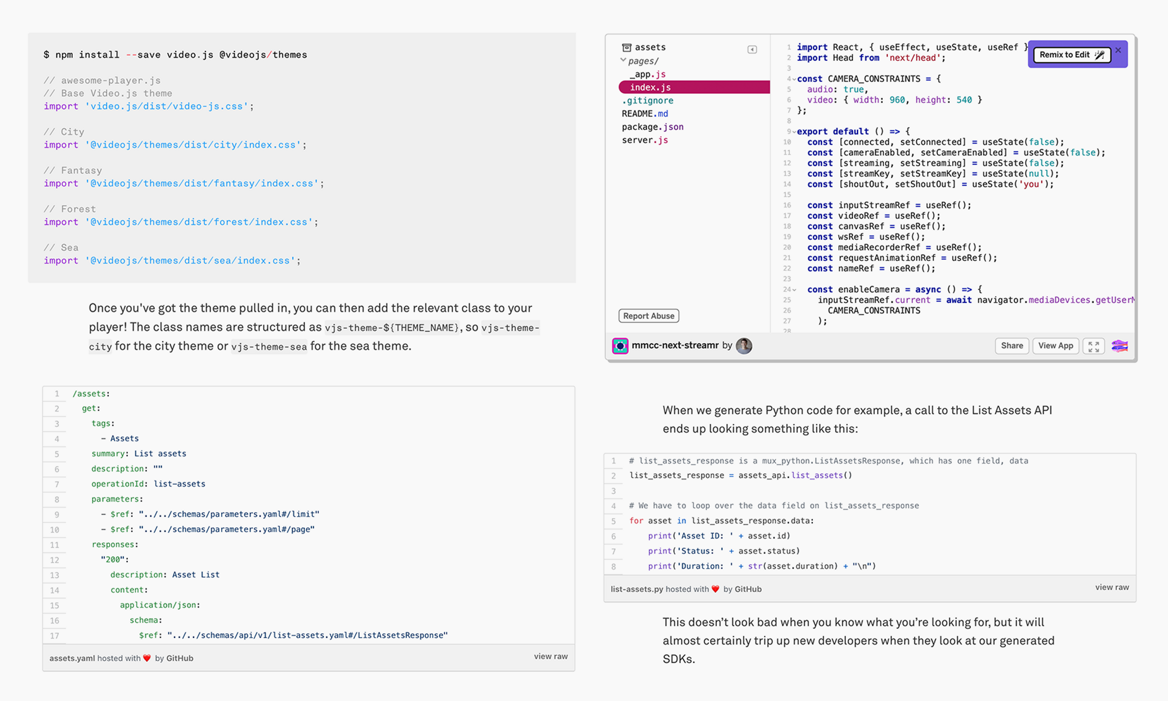
Adding code
Because we write for developers, and many of our writers are developers, we really care about how to import and display code. Initially I thought simply having things like accessible colors, nice line heights, and monospace fonts was good enough but I learned very quickly that we had to make it easy and compatible with developer workflows. Syntax highlighting was really necessary for long blocks with specific language requirements. Gists were needed for really long code samples that synced with an actual Github Gist file. Later on we also added sandboxes like the Glitch code editor for more interactive code samples.
Multiple authors
Very few projects are complete solo efforts. Just like it’s much easier to have teammates to help build something it’s also easier to have help writing about that something that you built.
Knowing how well it’s performing
Not everyone has access to Google Analytics or even if they do they’re not likely to login and know where to look at the performance of their post. We added some basic stats integrated right into the CMS. We thought making this look like a leaderboard also might add a nice little competitive incentive.
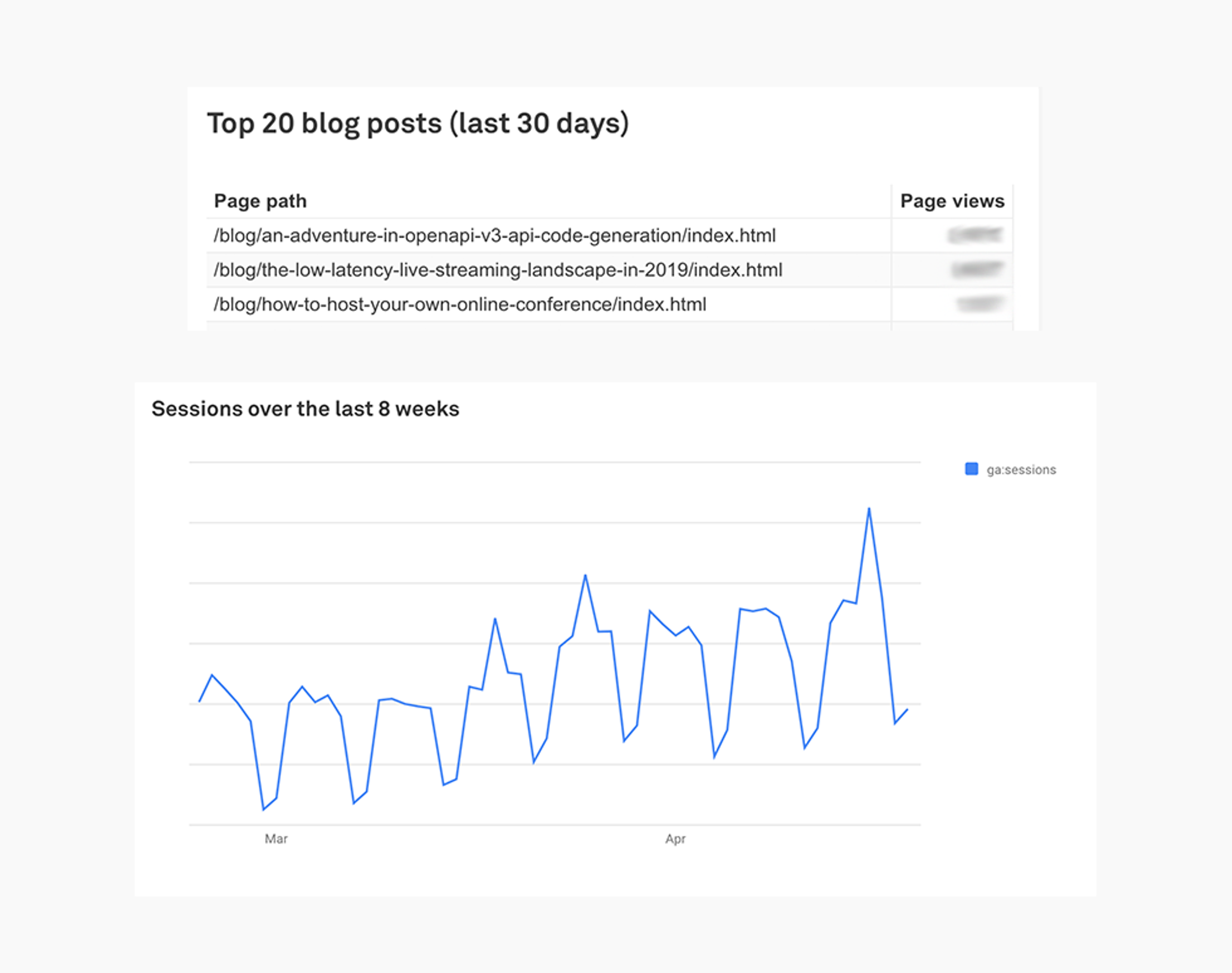
So... Has all of this been effective?

^^ The Mux team since launching the new process + design