We shipped a shiny new docs site: docs.mux.com. This is the story of why and how we did it. Today, I’m going to talk about some of the usability testing we did that led to that decision, and about how we think about docs as a core part of the Mux product.
Everything starts with DevEx
7 months ago I wrote about Developer Experience at Mux. Since then, we've brought on some really great folks to build a better experience for the developers using Mux. Growing the team has allowed us to branch out, and given us the bandwidth to take on more ambitious projects.
We started tackling this docs project at the end of 2020. Our previous docs site was pretty good, and we‘re really happy that it got us through 2020 to where we are today. When we looked at our goals for 2021 and our ambitions as a company, though, we realized that we needed to step up our documentation to the next level.
If you’re an API company, docs are a product
Mux is an API company. New developers are finding us and integrating video into their applications every day. Every interaction a developer has with our platform is a touch point that affects whether they decide to become a customer. Touch points include what other developers have told them about Mux, a Mux SDK they install, a blog post they find that mentions Mux, logging in to the Mux dashboard, and perhaps the biggest touch point of all: reading our documentation.
If the documentation doesn’t help you accomplish your goal, then we’ve lost the opportunity for you to be our customer – and our fan. We wanted to make more happy customers, and more Mux fans, so it was time for a docs refresh project.
The playbook for executing this project is the same one we use when launching a new product:
- Start by asking the user. What’s the pain point? What goals are users trying to accomplish? Get on calls with users. Understand their pain. Have UX designers and developers participate.
- User testing. As we iterate towards a solution, check with stakeholders and users to make sure we're headed in the right direction. Make corrections as needed.
Content
What's most important is quality content. You can make docs as pretty as you want, but if their content isn't useful, then it's useless. During our design process, we talked to users about how they engaged with Mux when they were getting onboarded, so that we could learn about their pain points.
In general, people liked and complimented our docs, but a few things stuck out. Some quotes from users:
“I’m honestly unsure whether I’m using Live Streaming, Playback, if those are different or part of the same thing.”
“It's not clear what steps are involved or what I will accomplish by the end of this guide.”
“I don't understand these terms. What are Signed URLs? What is a Storyboard?”
Above all, we learned that the actual content in our documentation was good. The users who we talked to told us they were able to understand our documentation and use it to accomplish their goals. The problem was finding the right documentation.
Usability
Because Mux has two distinct products – Mux Video (we process, host, and deliver all your video content) and Mux Data (install our SDK into your video player and we'll monitor your video's performance across all platforms) – we need two distinct sets of documentation.
When we dug more into usability, and watched users navigating our docs, we found some were definitely getting confused between Mux Video and Mux Data. Most commonly, it was Mux Video users who clicked around and ended up going down a Mux Data rabbit hole that was completely irrelevant to what they were trying to accomplish.
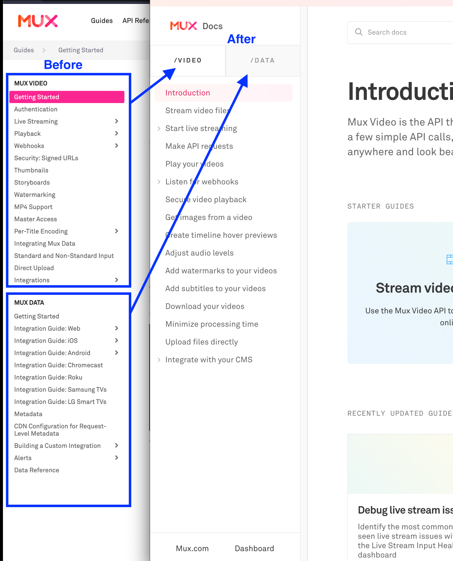
In the old version, we had one sidebar with both products. There was no clear dividing line between the two, just a boldfaced header. And both sections began with the phrase "Getting started". When writing instructions, always consider how people might misread! The new version has two tabs side by side – and, very importantly, only one tab is visible at a time.
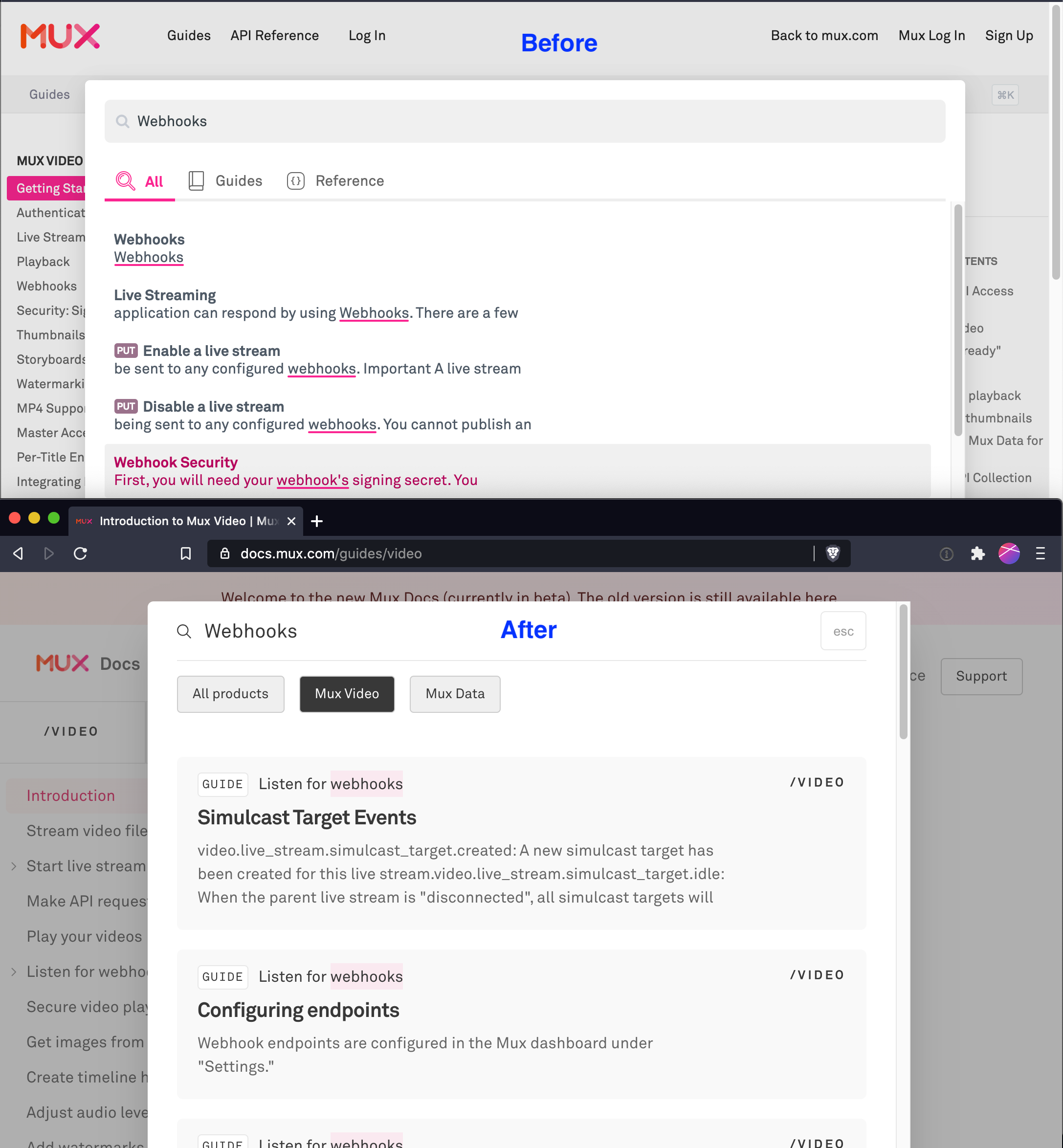
In our old docs, the search tool wasn’t easy to find. Most of the users we talked to admitted they never realized we had a search function! Learning this has made me a lot more conscious of how I use other products' documentation. I always use search. For every product, if I need to consult the docs, my first instinct is to use the search function.
Search is maybe the most important feature for great documentation (after, of course, great content). If something isn't in the best place, search can solve that... unless the something that isn't in the best place is the search function itself.
So the first thing we had to do was make the search function easier to find. We also split out search results between Mux Video and Mux Data.This goes back to my earlier point about developers who were using Video, getting confused when they accidentally ended up in Data documentation.
Terminology
The old guides were full of jargon: some of it industry-specific, some of it Mux-specific. Titles for guides were not intuitive for a developer trying to accomplish their goal. In retrospect, these guides are more useful for other Mux employees than they are for external developers.
Compare these terms:
- Security: Signed URLs vs. Secure video playback
- Playback vs. Play your videos
- Standard and Non-Standard Input vs. Minimize processing time
- Thumbnails vs. Get images from a video
- Storyboards vs. Create timeline hover previews
The first options are Mux jargon, unclear to developers who aren't already familiar with it – for instance, 'Signed URLs' and 'Storyboards' are just what we happen to call those features.
This was painfully obvious after it was pointed out: as developers who are intimately familiar with Mux's inner workings, we're too close to the problem to see it clearly. Something something forest for the trees. We had to take a few gigantic steps back and consider a few major questions:
- What are developers actually trying to do when they visit our documentation?
- What features does Mux have that can help them do it?
In order to answer these questions, we did user interviews with customers who had recently onboarded. We do a lot of these interviews; internally we call them "win/loss" interviews, and the point is to learn how developers found Mux in the first place, what they were thinking while they were evaluating Mux, and what factors influenced their decision to either become our customer (win) or find another way to fulfill their video needs (loss). For the purposes of the docs refresh project, we adjusted the interviews so that they had more emphasis on when new developers started exploring the documentation.
We started by asking developers about their goals, and paying attention to the terms they used when describing what they'd been trying to do. A great example is the feature that's triggered when a viewer hovers over the timeline of a video and sees thumbnails as they move their mouse. This is particularly useful for long videos, where viewers might want to quickly find a specific part of the video. People have gotten used to this on YouTube and other platforms, so developers using Mux often want to include this feature in their applications.
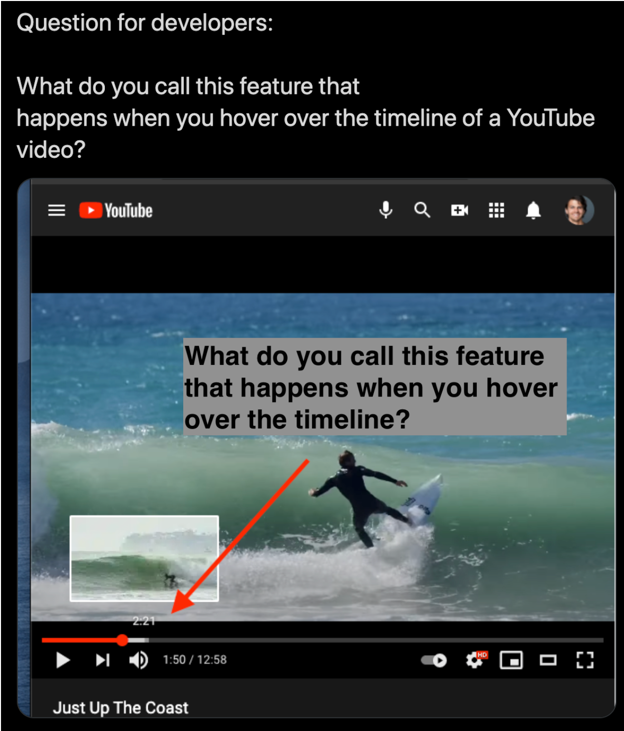
When I asked the question above to general developer audiences, I heard things like “scrubbing”, “timeline preview”, “preview thumbnails”, “hover”. Our new name for this guide is “Create timeline hover previews”; its old name was “Storyboards” (which is the name of the Mux feature that enables this function).
Next, we set aside two 4-hour working sessions (1 session for Mux Video and 1 session for Mux Data), where we figured out what was the definitive list of guides that we needed, and what problems each one solved. Each working session was a group of 4-5 Mux team members, and went like this:
- 15 minutes solo: Working alone, everyone wrote down all the questions that they could think of, that a developer might want the docs to answer. We each came up with ~30 questions. They were all like this: What kind of inputs do you support? Why would I use this over s3 or something? How to let users upload videos? How do I authenticate API requests?
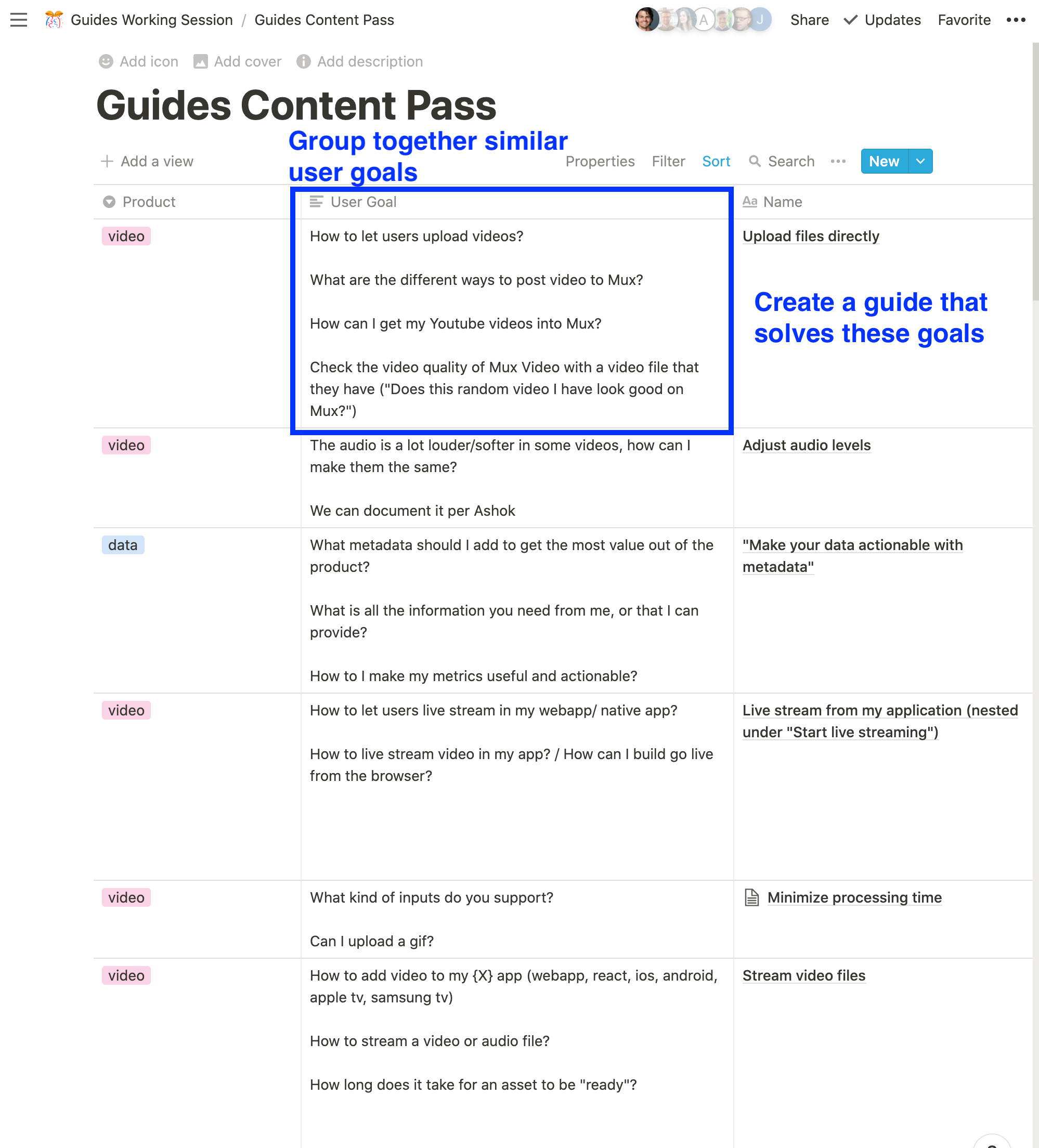
- 60 minutes grouping similar questions: Next, we went through all the questions together, and clustered them by general topic. When we were done, we had about 35 clusters, and prioritized the ones that were most important.
- ~2 hours of coming up with new guide names: We went through each cluster, and picked a single name for the guide that was centered around that cluster's goal. We made sure that the content in the guide would answer all the questions from that cluster.
The result of these 4-hour sessions was a document that looked like this:
Style guide for guide style
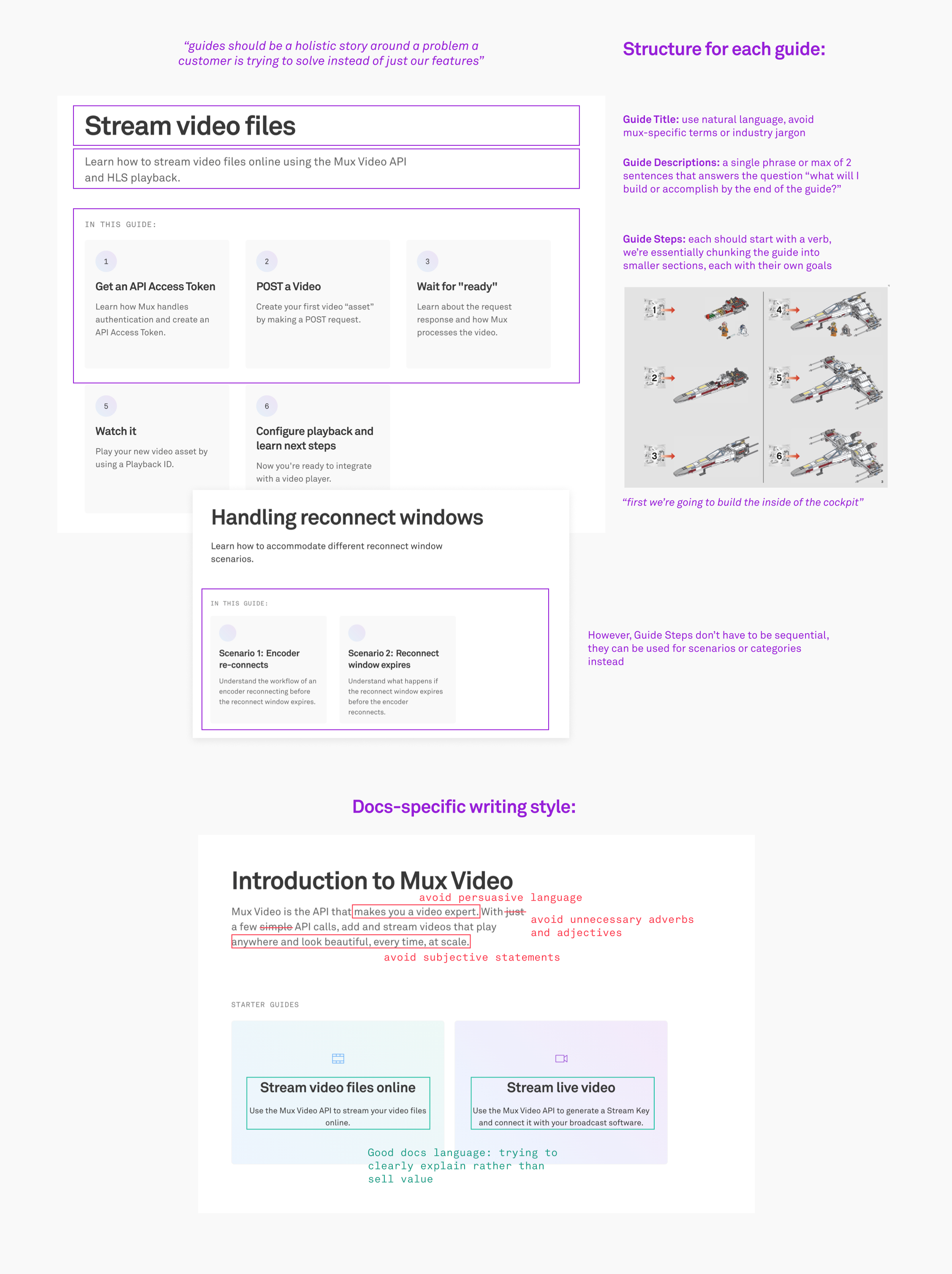
Based on the user feedback we got about the guides being confusing, we came up with a style guide to solve these pain points. We realized that it was important to standardize the guides, framing the content in a way that was approachable and easy to understand.
- Guides should be a holistic story about a problem a customer is trying to solve instead of listing just our features
- Guide Title: Use natural language. Avoid Mux-specific terms or industry jargon
- Guide Description: A single phrase (2 sentences, max) that answers the question "what will I build or accomplish by the end of this guide"
Nuts and bolts
First and foremost is the user experience - that is, the customer-facing part of the project. Next (no pun intended) is the how: what tools we used to build the new docs.mux.com, and how we put the pieces together.
Next.js framework
It was easy to choose a framework. Time and again over the past two years, I’ve found myself reaching for Next.js on nearly every frontend project I’ve been involved with - and not just because it let me make that pun last paragraph. When it comes to Developer Experience, Next.js is 🤩. It covers all the bases for building a frontend application (with just enough server-side functionality when you need it):
- Built-in code splitting to optimize bundle size on initial pageloads
- Server-side rendering for SEO
- Automatic image optimization with next/image
- API routes for a few piece of backend functionality
For a fully open-source Next.js project that we did last year, take a look at stream.new.
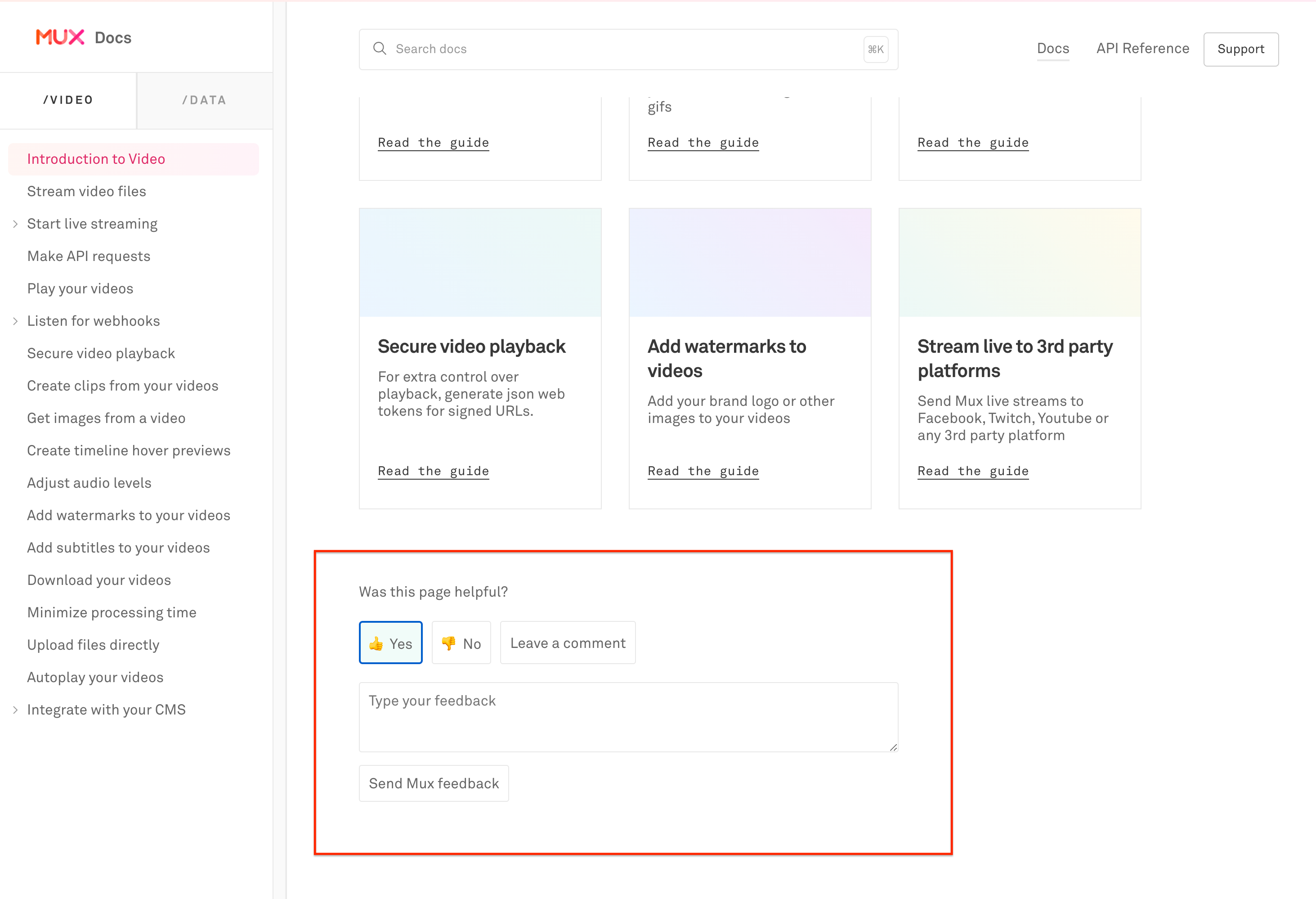
Next.js lets us easily add server-side functions. It was really handy for things like the feedback form that creates new records in an Airtable base.
Algolia for search
The new search is powered by Algolia. Building the search index is done automatically through Github actions when there’s a new push to master.
name: Update Search Index
on:
  push:
    branches:
      - main
jobs:
  build:
    runs-on: ubuntu-latest
    steps:
    - uses: actions/checkout@v2
    - name: Install modules
      run: yarn
    - name: Lint
      run: yarn lint
    - name: Update search index
      env:
        ALGOLIA_API_KEY: ${{ secrets.ALGOLIA_API_KEY }}
        ALGOLIA_INDEX: ${{ secrets.ALGOLIA_INDEX }}
        ALGOLIA_APP_ID: ${{ secrets.ALGOLIA_APP_ID }}
      run: yarn index-for-search
The task that builds the search index has the following steps:
First, run a static build of the Next.js application with next export
const fs = require('fs');
const { exec: execSync } = require('child_process');
const { promisify } = require('util');

const execP = promisify(execSync);
const exec = (cmd) => execP(cmd);
const readFile = promisify(fs.readFile);
const writeFile = promisify(fs.writeFile);
const nextConfigPath = 'next.config.js';

async function nextExport () {
  const nextConfig = await readFile(nextConfigPath, 'utf8');

  // next export only works with the server target
  await writeFile(
    nextConfigPath,
    nextConfig.replace('target: \\'serverless\\'', 'target: \\'server\\''),
  );
  // Build project
  await exec('next build && next export -o dist');
  await writeFile(nextConfigPath, nextConfig);
}
After next export, the dist/ directory will be populated with static HTML files. We use globby to read the files we care about, parse the html with cheerio and iterate over the titles, paragraphs, and text content that we care about to build out the Algolia search index.
Open API spec
We’ve been maintaining an OpenAPI v3 spec for Mux for some time now. Phil wrote about those adventures. This lets us generate some of our API wrapper SDKs (ruby, python, php and go). Since we already have this OpenAPI spec, we thought it would be really nice to generate our API reference documentation.
A common tool for accomplishing this is Redoc, so that's what we first reached for. It was quick to spin up and add into React with <RedocStandalone /> (here's a code sandbox where I started playing around with it).
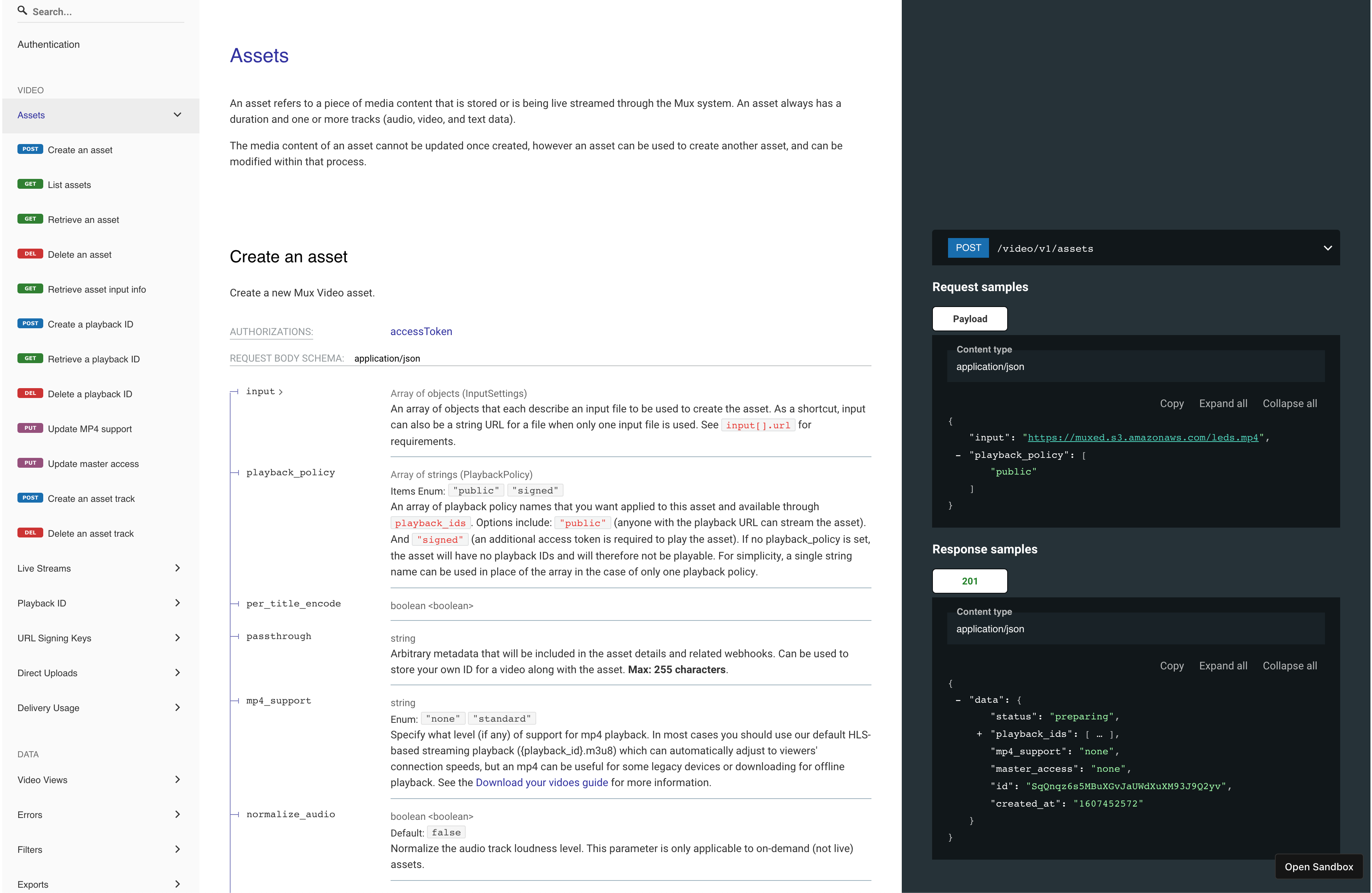
Redoc worked well with our OpenAPI spec and it was insanely quick to set up in React (3 lines of code). But it had a few major shortcomings:
- We wouldn't be able to plug this into our new design with the design of our split nav bar on the left (splitting out the "Mux Video" and "Mux Data" reference into two separate tabs)
- It doesn't work so well with server-side rendering (Redocly/redoc#1365) (although I’m confident they’ll fix this eventually). This was a hard blocker for our requirements: for SEO reasons, we need SSR.
We tried out a lot of tools that do API reference auto-generation, and none of them were quite what we needed. We needed to generate the API Reference based on our OpenAPI spec but it needed to fit in the custom design of our new docs site. To do this, we had to drop down one level deeper. We needed to parse the OpenAPI spec ourselves and build out the UI we wanted.
Swagger has an amazing tool that helped with this task. It's SwaggerParser, and it was a lifesaver. SwaggerParser will take an OpenAPI v3 spec, validate it, and build a JSON object with resolved references. Here's an example - the left side is the raw OpenAPI v3 spec in JSON format and the right side is what you get after sending it through SwaggerParser.validate.
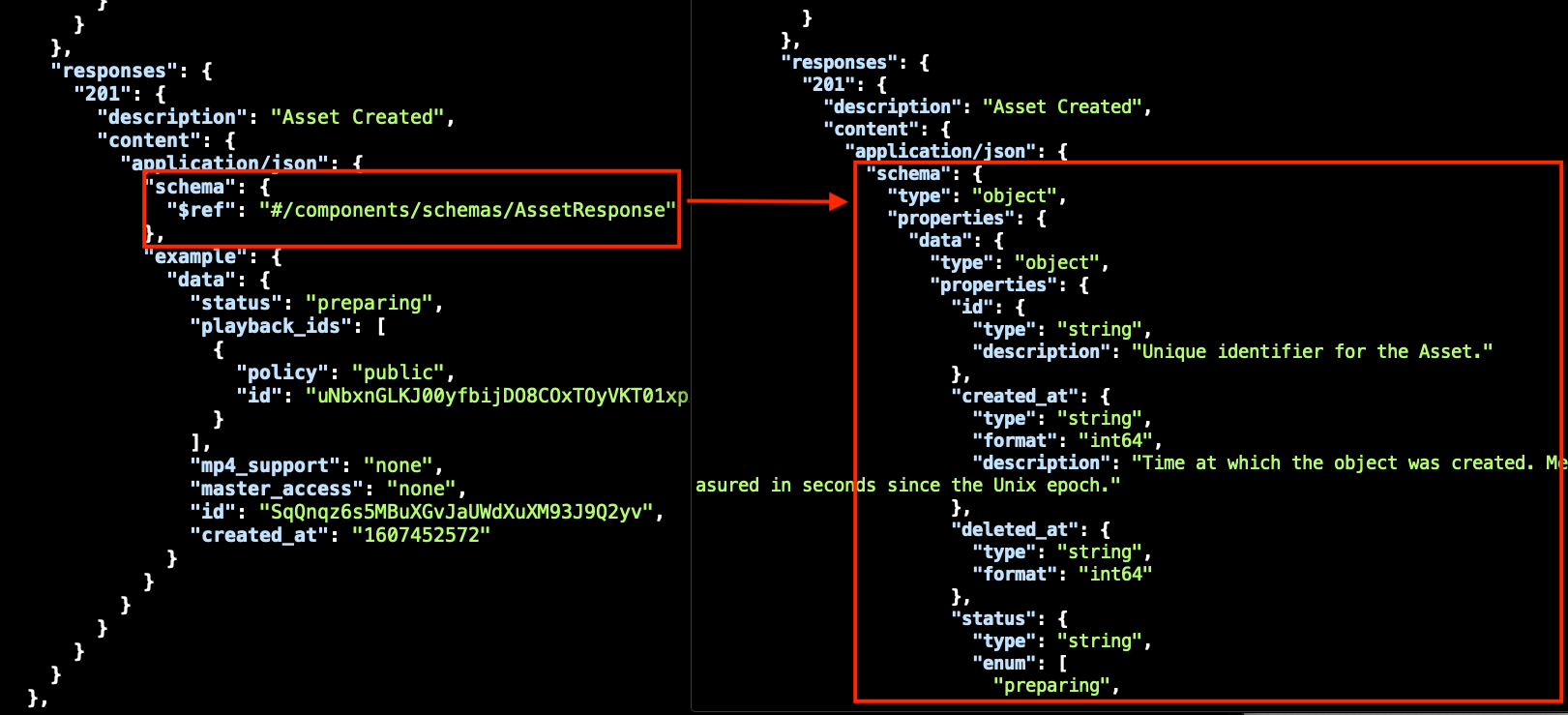
The validated SwaggerParser output is now much easier to work with in our Next.js application. We can use getStaticProps on the server side to pull in the parsed spec, pass it down as props into our React components, and build out the UI that we want. Now we have a useful representation of the spec, and we're in React world where we can use whatever components and styling we feel like. This gives us the flexibility to build out the experience we wanted with our API Reference in a way that fits the design of the new docs site.
Feedback please!
We'd love to hear any and all feedback. If you used the old docs (which are still available at docs-legacy.mux.com), how do the new ones compare? If you're a new Mux user, we want to know any and all pain points you run into when you're a new Mux user. We’re always iterating and looking at how we can improve your experience as a developer.


